Email marketing is one of the most preferred channels for delighting and retaining customers at almost every stage of the buyer’s journey from Convert to Close to Delight. Moreover, email is the only push-based marketing channel where all you need is the email address of the subscriber and you can start building a long-lasting relationship with them.
Yet you are missing out
There is a good chance that your email may be a hurdle, preventing you from connecting with some of your potential subscribers. The reason may not be because of the email client’s incompatibility or deliverability, but a problem as simple as that your emails are NOT ACCESSIBLE.
Roughly, a billion people in this world (fighting disability as per WHO) face difficulties owing to digital inaccessibility and non-accessible designs. However, accessibility is grossly misunderstood to be associated with disability. The term ‘accessibility’ refers to the universal design of an environment for people with a wide range of abilities to use products in wide range of situations unassisted or with assistive technology.
Digital accessibility governs over the web as well as emails in a way that people are able to access your emails without relying on standard devices such as keyboard and mouse or by using adaptive technologies such as screen readers, screen magnifiers, eye tracking systems, and advanced sip-n-puff devices.
Interestingly, research shows that online purchases worth $225 billion is done by people who rely on accessibility.
What are accessible emails? How can accessible emails be helpful?
Accessible emails are not a separate breed of emails, but HTML email templates built keeping into consideration certain protocols. They are emails with a structured email copy, visual hierarchy, non-intrusive code and simplified user interface. Including relevant ALT-txt to your images is a small step towards making your emails accessible. This has two advantages
- Visually impaired subscribers can use screen readers to read out the alt-txt.
- Anyone reading the emails without images (owing to email client disabling them or owing to low bandwidth) can read the alt-txt.
Similarly, by having the CTA button in a contrasting color from the background helps subscribers differentiate and easily identify the button.
While, we shall be discussing the basic requirements of an accessible email in detail later, it is safe to state that an accessible email can help you greatly in widening your customer base, besides improving the user engagement rate. Your email subscriber can only be engaged when you provide a good user experience to them and there is always an increased chance of engaged subscribers leading to loyal customers. Remember, loyal customers are your brand ambassadors who can play a very critical role in further widening your customer base by recommending your products or services.
Qualifications of an accessible email
As stated earlier, an email needs to pass certain checkpoints to qualify as accessibility in email.
Email Design
Highlights in contrast colors: Colors are one of the three factors that give an email template its identity. Every color brings out a specific emotion within us but to some fraction of the world’s population, colors are a major hurdle. Color blindness roughly affects 1 in 12 men, 1 in every 200 women and there are three types of color blindness
- Inability to distinguish between red and green (Deuteranopia)
- Inability to distinguish between blue and yellow (Tritanopia)
- Complete color blindness (Monochromia)
When building an accessible email use colors that are contrasting to each other. It may be regarding text and background contrast, CTA button, hyperlinks or Offer dates that need to be highlighted.
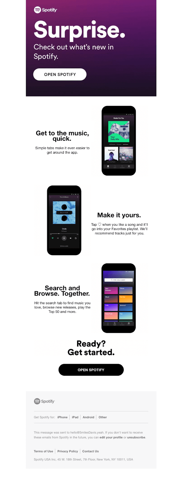
In the below email by Spotify, the CTA button stands out since the colors used are contrasting to the background in both instances.
Ample Whitespace: While using contrasting colors helps you highlight your email content better, it relies heavily on whitespace. Without ample whitespace, a person with dyslexia will have a hard time focusing on your email copy and consequent disengagement, which may lead to unsubscribe. Also, an email copy with paragraphs of tightly cramped text is surely going to be a turn off for any subscriber, and when it comes to making your emails accessible, besides surrounding your emails with typographic margins, inserting paragraph spacing is essential to make it legible for the screen reader to scan.
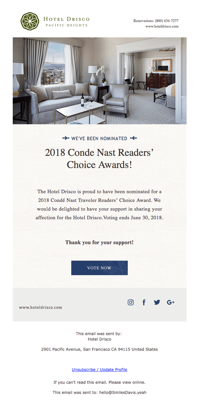
In the below email by Hotel Drisco, the elements are well-spaced in such a way that the email copy is easily readable even from an arm’s length.
Additionally, avoid using any animated GIFs that flash repeatedly as they might trigger photo-sensitive/ epileptic seizures in some people.
Tappable CTA buttons: People with motor-impaired disability or those viewing your email in small screen devices may find difficult to ‘click’ your CTA if it is smaller than 44px. You are therefore suggested to use a slightly bigger button as that will require less precision from the end-user.
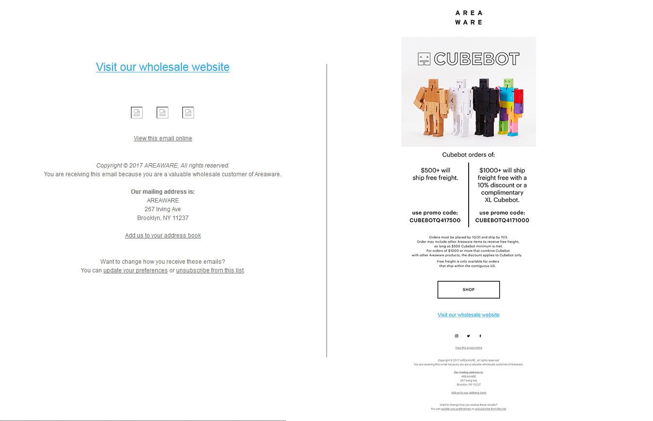
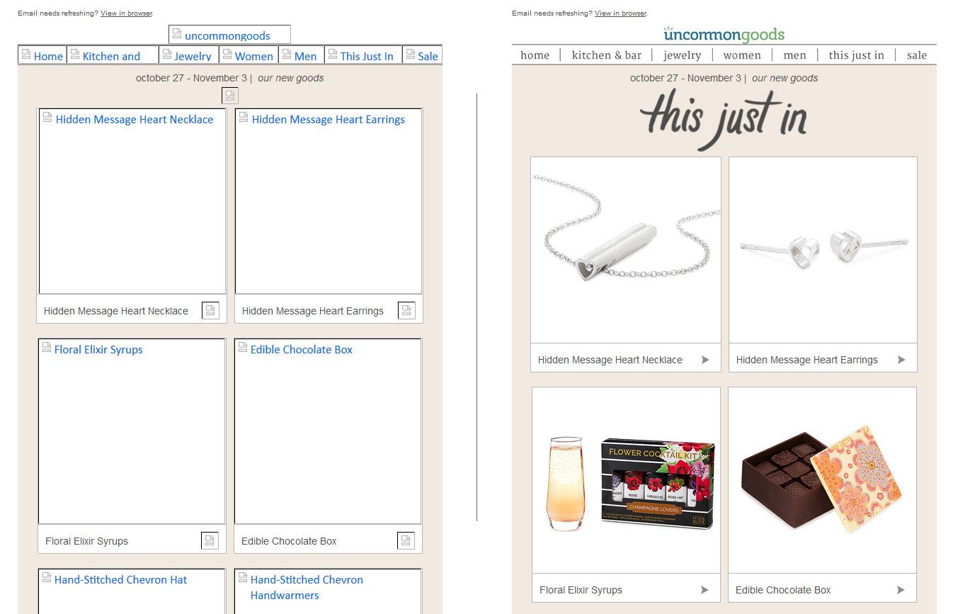
Maintain text-to-image ratio: Most brands tend to send emails that are just an image with the email copy within the image. While it is a good way to be flagged as SPAM, it provides a very bad user experience, especially when the images are disabled. Imagine, you open an email expecting to see something like the email on right and all you see is the email on left.
Even worse would be getting an email, with a giant paragraph of Alt-Text since the image is disabled (shudder!!!).
Email Coding
This is the backend of your email that doesn’t directly affect your subscriber but is still important part of creating an accessible email as an email client will render your email depending on the code quality.
Keyboard and Screen reader-friendly coding: While most of your subscribers are going to use conventional devices to read your emails, there will be subscribers who will rely on assistive technologies to navigate. Since <table> layout is used to code emails, your email code needs to help subscribers navigate through your email using their keyboard. This way any person with some form of motor impairment can use the ‘tab’ key in their keyboards to reach the CTA button and ‘click’ on it using ‘space’ or ‘return’ key.
By adding ‘role=presentation’ inside every <table> in your email, screen readers will read the content inside the table instead of each cell.
Additionally, check whether your emails can be pinched to zoom when viewed on mobile devices.
Relevant Alt-Txt to your images: As stated earlier, adding relevant alt-txt to your images helps people to understand what your image conveys, even when the image is not viewed. If any your graphic is purely for representational purpose such as an arrow in the CTA button or a vertical spacer, add an alt attribute but leave the field empty. This way a screen reader will pause at the image and then move ahead.
Distinguishable semantic tags: Create a contextual hierarchy by using appropriate semantic tags to mark up your email copy. Use <h1> to <h6> to differentiate between different heading categories and envelope your email copy between <p> tags.
In the following email by Ellevest, each heading is easily distinguishable, and the body copy can be easily differentiated. All thanks to the proper semantic code.
Email Copy
Subject line that is self-explanatory: A subject line is the gateway into your email. A subject line needs to start a conversation that is further extended in the email inside. It needs to be concise, self-explanatory and tickle the subscriber’s interest when read directly or by using screen reader.
Hyperlink at relevant text: in case you are using text-based hyperlink, it is a good practice to hyperlink on the relevant text instead of a generic text such as ‘Click here’. This way when someone reads the email using a screen reader, the subscriber will understand what they stand to earn when they click the hyperlink.
Similarly, your CTA copy should be always explaining what to expect when clicked. Actionable words such as “Download your eBook copy” or “Start your free trial” are going to be conversion-prone for subscribers reading the email directly also.
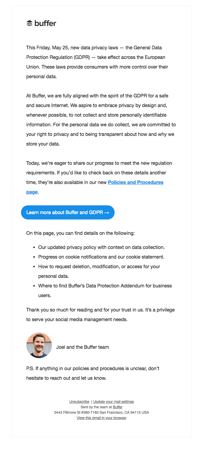
In this mail by Buffer below, the text used for links are relevant to the hyperlink and provide a context regarding what the subscriber can expect on clicking the links.
Legible Email Fonts: While stylized fonts are visually appealing, they can be disastrous if it is illegible. Proper typography in email is important for emails when not considering the accessibility aspect. Best practice is to use system fonts and in case you wish to use any decorative font, restrict it to the images. If you wish to use a custom font, always have a fallback system-based font. Additionally, keeping the font size > 16px is a good practice, as larger the font, easier it will be to be read without much effort.
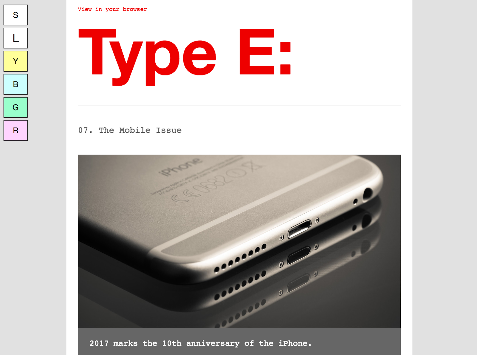
Type E:, an email newsletter by Paul Airy, provides an interactive way to enlarge the font-size of his email by adding buttons for different font-size on the side of the email. Additionally, he provides an option during opt-in, where the subscriber can choose to receive the email with tinted backgrounds.
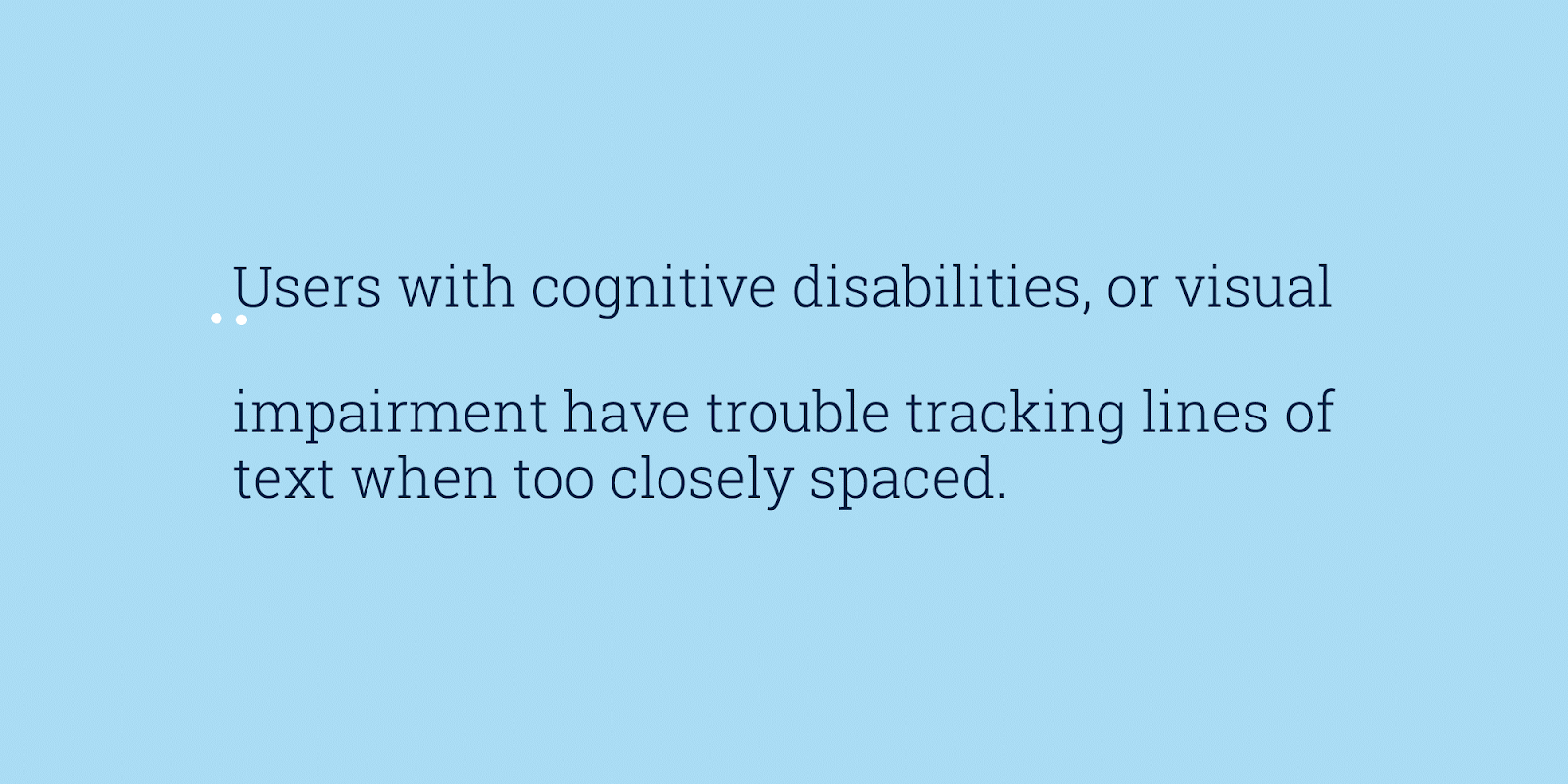
Ample Line space and sufficient line length: Line length is the number of words you accommodate in a single line. The probability of eyes tiring is proportional to the line length. Longer line length means the subscribers’ eye travels longer length to reach the first word of the next line. Combine it with small line spacing and your subscribers are going to get tired by the third sentence. Ideally, the line length needs to be 10 words long and the line spacing needs to be 1.5x times the font size.
What and how to test in your emails for accessibility
Testing for accessibility is different for different devices.
Desktop
- Content is fully keyboard accessible
Use your keyboard arrows to scroll across your email length. Use tab to shift through different hyperlinks and click them using space or return keys. Also ensure that your links open in a new tab for those using webmail or using the view online to view the email on browser. - All images retain alt text
Using online tools such as Wave Tool or Google’s Accessibility Developers Tools to manually disable images. The images with no alt attribute should show ‘noalt’ warning - Check for semantic HTML markup
Right click on your email and select ‘Inspect Element’ and find tags <h1> to <h6>.
Alternatively, you can inspect the tags in the HTML code. - Does your email break on zooming?
Press ‘ctrl’ and ‘+’ to manually force the email to zoom and check if the email layout changes on zooming.
Mobile
- Pinch Zoom support
Use the two fingers ‘Pinch to zoom’ gesture to check if the email zooms till the text size is viewable. - Voiceover support
Use in-built screen readers such as Talkback for Android and Voiceover for iOS to check whether the body copy is read out aloud.
Wrapping Up:
As evident from this article, accessibility in email is creating a good user experience irrespective to who is reading your email in any given situation. When your subscribers are able to read your emails without any discomfort, you are building trust, significantly reducing your email unsubscribes and this eventually helps you expand your customer base. Are your emails accessible? Conduct a test and share your experience in the comments below.
