As of 2017, mobile commerce sales in the United States reached $156 billion. By 2021, this figure is expected to skyrocket to more than $420 billion. However, during the third quarter of 2018, the conversion rate of online shoppers using a smartphone was 1.56 percent, in comparison to the conversion rate for shoppers on a laptop or PC hovering close to 4 percent.
Whether your own website’s analytical data is in line with national averages or has fallen behind, understanding common pitfalls hindering your is an important first step.
Poor Mobile Website Design
No matter what initially drives customers to your website, as soon as the landing page loads they will make a snap judgment about whether it’s where they need to be. And this is definitely a case where a picture is worth a thousand words. The visual impact of the landing page—including the pictures, as well as the color scheme and font style—should clearly appeal to your target audience. Your site’s new visitors are less likely to read the text if the design is unappealing.
Be careful not to overdo it, though. Your visitors may immediately click away from your website if they are overwhelmed or annoyed by obnoxious graphics and audio. They also may click off of your website if it is not properly formatted for the device they are using. With so many other distractions on their mobile at their fingertips, they won’t be motivated to spend their time on a website that isn’t compatible with their device.
Make sure your site loads quickly on both mobile and desktop browsers. Analyze your website’s data. Pay attention to the pages with minimal click-throughs. Test the formatting for all pages across multiple devices. By identifying and improving poor design elements, the appeal and functionality of the website will be improved.
Lack of Personalization
In a brick-and-mortar sales environment, customers feel appreciated by a warm greeting when they walk in the store. The sales staff provides attentive service and thank the customer for their business as they leave. Personalization in mobile commerce is equally important, but it requires a different approach. Your customers want to feel special and appreciated, and this starts when they first land on your website.
Customers increasingly expect the e-retailers they frequently do business with to pay attention to their activities. After your website greets them by name, it should make thoughtful recommendations based on their previous activity. For example, if a customer recently made a purchase, a suggestion about tracking a package or contacting customer support is beneficial.
Personalization also extends to customers who drop out of the sales funnel. For example, a personalized email can entice a customer who left a specific page to return and make a purchase. A special promotion or a suggestion of similar products are some personalized approaches to encourage the customer to return and make a purchase.
Vague Product Information
While a solid return policy is essential for online purchases, customers typically do not want to make an online purchase on a trial basis. Online shoppers need access to detailed information about the product they are interested in to feel confident the product will meet their needs. Color options, sizing charts, product dimensions, weight, materials, reviews, and other essential details should be clearly listed.
There are a few telltale signs that your product descriptions are too vague. Multiple customers are making similar inquiries about products. Products are frequently returned for similar reasons. Poor customer reviews indicating the product was not what they expected. If you notice any of these signs, update your product descriptions to address any confusion.
A Complicated Checkout Process
One of the benefits of online shopping is convenience. There are no lines at checkout, and the customer should be able to proceed through the payment process and await the arrival of their goods without any issues. A complicated checkout process creates unnecessary stress and frustration and is a common cause of abandoned shopping carts. Regardless of how amazing your products are or how well-designed the rest of your website is, customers will shop elsewhere if they cannot easily pay you for the items they want.
After analyzing your website’s statistics, you can quickly determine if abandoned shopping carts are a problem for you. Your website design must allow customers to complete their transaction with the fewest possible steps and without the need to share an excessive amount of personal information. It should also provide multiple payment methods, including PayPal and other similar payment processors.
Some reputable providers that offer POS card readers have branched into integrated online payment processing. They provide secure, fast processing on and offline. Because the processor that you use can impact the checkout experience, compare available options today to identify ways your site can improve.
Slow Load Times
Seconds matter when a website is loading. Online shoppers are impatient and want instant satisfaction. Every page on your site should load rapidly, including all images and videos. Some of your customers may have a slow connection, so your website should be designed with this in mind. Time the load speed from various devices using different connections to determine if your site will have slow load time issues. If your web analytics show a high exit rate on a page, take a close look at the speed your page is loading.
Run a PageSpeed Insights analyzation on your site to make sure it’s up to par. The tool will generate a to-do list for you to implement and enhance the user experience of your site for mobile and desktop users.
Slow load times are caused by many things, such as the size of images and the number of rich elements. While your website should be appealing, a graphics-heavy page can be problematic in other ways. In addition to removing unnecessary graphics and optimizing images, caching the website can dramatically improve load times.
Poor Customer Service
Another factor affecting mobile commerce is only minimally related to the website. Your customers need confidence they are making a purchase with a real company rather than a shadow business. When they call your customer service phone number during business hours, they expect to have their call answered by a live, knowledgeable professional.
If your website utilizes a chat feature or suggests emailing for assistance, a prompt response is essential. Customers who grow frustrated before making a purchase likely will not finalize the transaction. Those who receive bad customer service after their purchase may leave negative reviews online and may not become repeat customers.
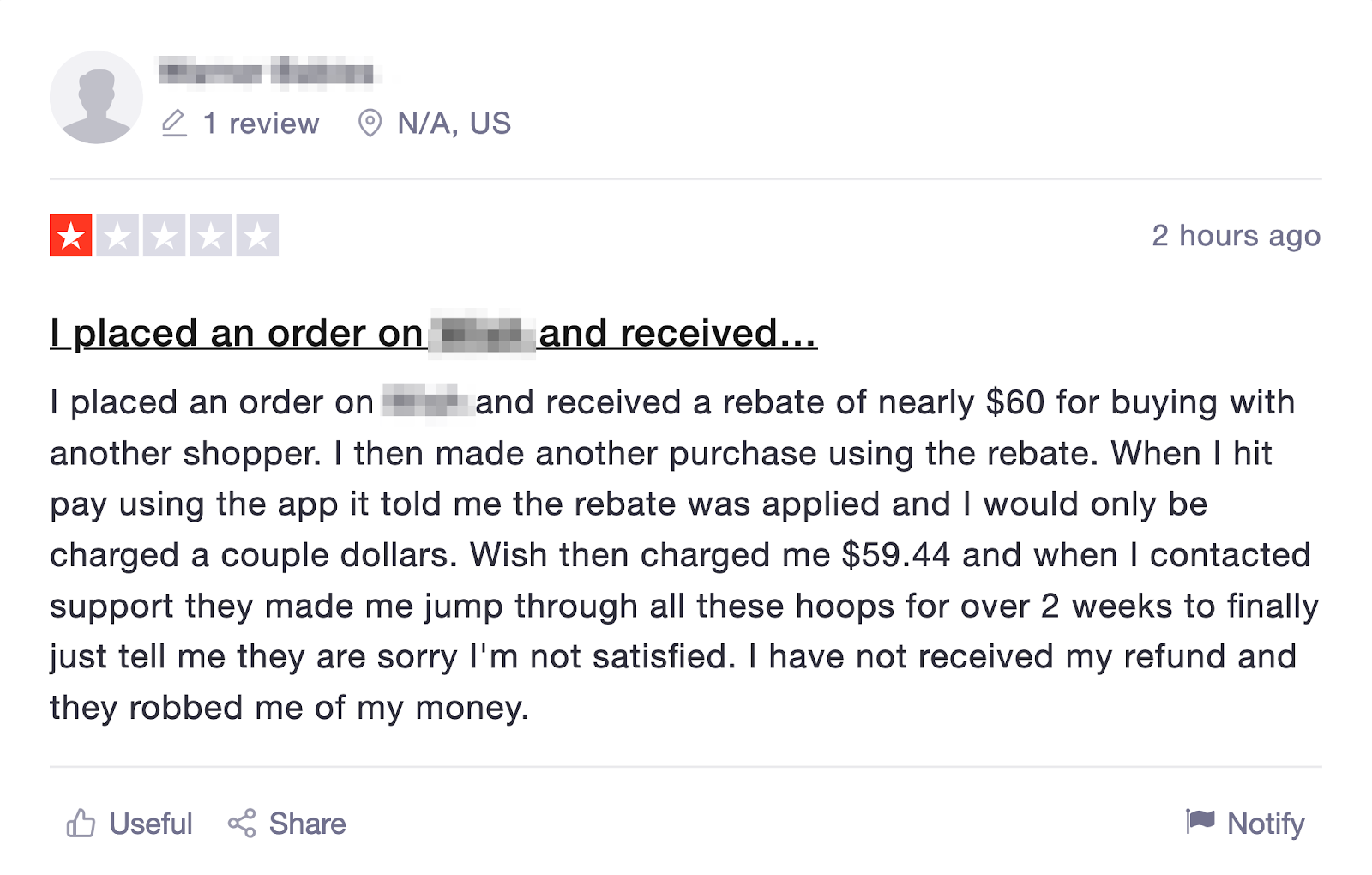
Signs of poor customer service are obvious, including very public, very harmful negative reviews from upset consumers. Improving communication methods with customers and empowering the first-line communicators to assist customers during the first correspondence can save your brand image and improve your conversion rates.
Final Thoughts
Mobile commerce is not a passing trend. Instead, it is becoming more commonplace and is even preferred among many consumers. Identifying issues with your company’s shopping experience today is essential to maintain superior customer satisfaction ratings and high sales numbers going forward. The first step is to analyze your website and sales experience in these critical ways to identify issues. Use the advice above to step out onto the mobile commerce path on the right foot.
Have you encountered any of these issues on your site? Share below in the comments if you implement any of these tactics or if you’ve successfully overcome these issues in the past!


