Welcome back to the #AmazonDomination series; it’s been a few weeks but we’ve got a ton of new info for you!
In part one, you saw how to do keyword research using the Google Keyword Tool. In part two, you saw how to brainstorm for good keywords that will draw shoppers in.
Now you are in part 3, where you take that research and use it to build your product listing on Amazon.
The question now is this: will we be creating a unique product listing for our own proprietary product, or will we find an opportunity to map to a listing for a product we think can be better capitalized upon.
When creating a listing on Amazon, you don’t have much control on the design of the page itself since it is the default Amazon template. All you have control of is the product title, image, and description – and this is where we need to make sure our listing shines.
For the sake of explaining the listing elements that we can control, let’s assume that you are listing your own unique products. Hopefully you’ve already come up with the product you want to sell from steps 1 and 2. With keywords in hand, the title should be a piece of cake. Make sure your title is something that immediately answers a customer’s question or directly shows them that you have what they are looking for.
For example, “PowerBooster 2000” is not a good title – your customer might not have the slightest idea what it is. On the other hand, “PowerBooster 2000 Charging Pack For Apple iPhone 5” is much better, since it covers more keywords and presents the product much more clearly.
It is also more inline with Amazon’s official listing style guide — available here if you have a Seller Central login. While we always want to pay attention to the style guide, we also want to make sure our title compels the buyer.
Images should be nice, clear, and big. You can upload multiple images, too, so a good idea is to have a few images of just the product itself on a white background from multiple angles, and other images can be of the product in use.
The only thing left for us to handle is the description.
How to write a good description
Your product description is like the salesman on the shop floor. It has to spark curiosity, grab attention, and sell!
This always reminds me of the conversation Dr. Schultz has with Calvin Candie in Django Unchained:
Dr. King Schultz: Well, you won’t sell your best. You won’t even sell your second best. But your third best, you don’t want to sell him either? But if I made you an offer so ridiculous you’d be forced to consider it, who knows what could happen?
Calvin Candie: And what do you consider ridiculous?
Dr. King Schultz: For a truly talented specimen?
[looking at Django]
Dr. King Schultz: How much would you say, Django?
Django: Twelve thousand dollars.
Calvin Candie: Gentlemen, you had my curiosity, but now you have my attention.
When you write a product description, this is the effect you want to have on your customers! A good description doesn’t focus on just the product itself. Instead, think about who your customer is and why they would want to buy your product – then start writing. So instead of writing about just the features of the product, write about the benefits of the product. You can even join the two, either as feature-benefit, or benefit-feature, or you can even mix it up.
For example, a mobile phone might have 4G LTE capability – as a customer, I don’t care so much about 4G LTE as I do about browsing the Internet at high speeds. So a description for such a mobile phone would be something like this:
“Browse the Internet at lightning fast speeds with 4G LTE capability.”
Or “4G LTE capability lets you browse the Internet at lightning fast speeds.”
Do you see the difference between that and just saying “4G LTE capability”?
You also want to talk to your ideal customer. If they are not tech savvy, you will need to explain everything bit by bit and in detail. If your customers are already tech savvy, or familiar with the product anyway, you don’t need to go too deep into this.
Keyword density
Keyword density is a pretty shady topic in the SEO world these days. There was once a time that you could stuff your target keywords in a page’s meta tags and the more you stuffed, the higher you ranked.
It’s not the same thing today, though. While keyword density is a good concept, you don’t want too much of it – because it would look like you are trying to game the system, and instead of rewarding you by ranking you higher, Google would end up punishing you by removing your site from their index altogether!
Still, you need to have your keyword…
- in your title, preferably in a sensible sentence.
- 2-3 times throughout your page – or once every 200 words – and once in the first 100 words.
- sprinkled throughout the page with close variations. If you are targeting “black widgets,” you’d also want to use phrases like “widgets that are black,” “black colored widgets,” and “dark widgets.” See how all of these are close variants? “Multi-colored widgets” is a different term altogether, and would deserve a page of its own.
Using Amazon Seller Central To Create A Listing
Disclaimer: this section is a quick overview for Amazon rookies. Skip it if you know how to navigate Amazon Seller Central.
First, you need to sign up for an Amazon account (if you don’t already have one). Once you have logged in, you will see the main Seller Central dashboard – this is where you can see announcement and manage orders, add new products, and view balances.
Go up to the menu option that says “Inventory,” and when you mouse over it, a menu will pop out with an option that says “Add a Product.” Click on it to be taken to the product creation page. Next, you have a choice of either selecting an existing product or making your own – you want to make your own.
After that comes choosing a category. Enter a few keywords to find your category, or you can also do it manually. Then you will find yourself at the product information page. Here, the most critical things you will fill out are the product name, brand if applicable, description bullet points, main description, and pricing.
In the last tab, you can fill out additional information, like ingredients, directions, color, flavor, and a host of other details – you should fill this out first, so the 2000 characters you have for the description itself can be fully utilized for selling the product itself.
Don’t worry too much about the rest – the items marked with a red star are mandatory, and the rest are optional and really depend from product to product.
Elements of a good product page
Let’s take apart an Amazon product page and see what they are doing right. It’s safe to say that Amazon is an excellent model to follow when designing, since they are the undisputed king of online retail.
Remember, we’re looking for…
- A big, clear image: A picture is worth a thousand words – it’s also the most important part of any product listing. If you don’t know what you are buying, why would you buy it?
- Bullet points: Most product descriptions are really long, and online, people skim more than read. Think about it – isn’t that what you are doing right now? If you provide the main points of your product up top, you start to form an idea in your customer’s head before they get to the whole description.
- A thorough description: Like we discussed above, a product description has to be thorough, and focus on the benefits more than the features. Remember, you don’t buy something just because it’s awesome, you buy it because you want to feel awesome when you use it or have it! That’s how you sell it to someone else, too.
- As for the rest of the features of a product page, like a USP, a clear call to action, and social proof, since you are using Amazon’s own platform, you will piggyback on them.
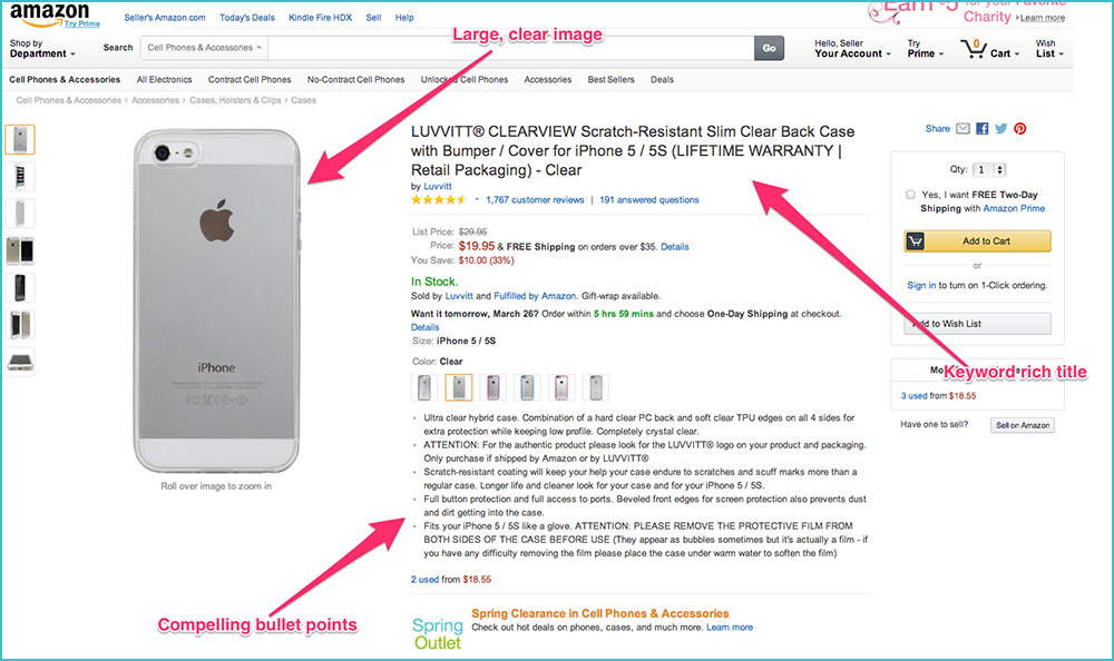
This first example is the #1 selling iPhone5 case on Amazon. Literally, #1 in the category:
This listing nails the title, image and bullet points. They even threw the warranty into the title! That’s brilliant.
Now, I’m a little surprised that the product description (below) isn’t more keyword rich, but in this case they appear to be getting away with it. I suppose it doesn’t hurt that it’s a great looking, highly visible accessory for one of the most popular products in the world…
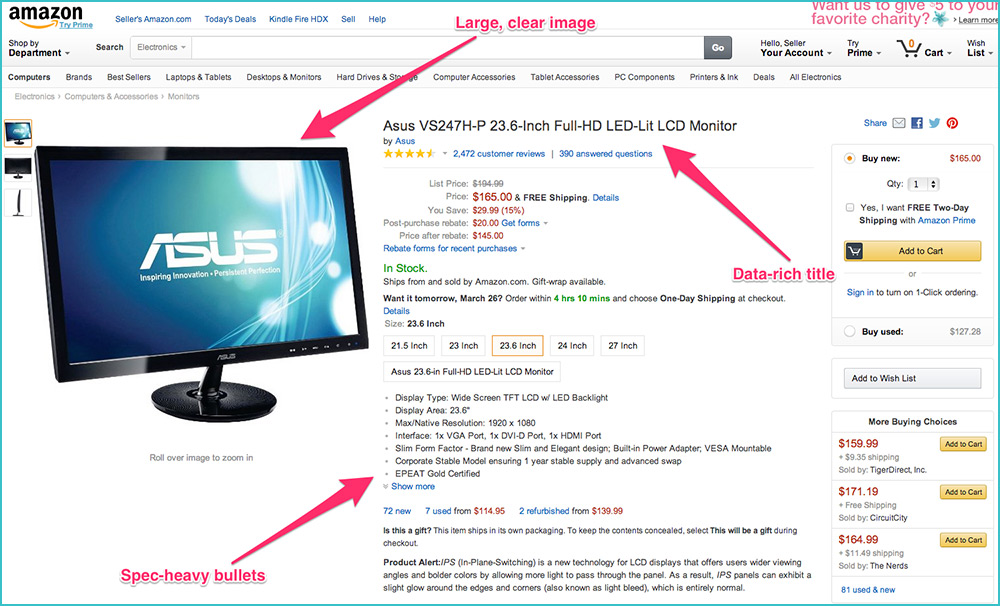
The next example I want to show you is from the #2 desktop monitor in its category. With this type of product, you have to change your approach slightly. Remember, know your customer! The title and bullet points lean much more spec heavy, as a shopper for a quality monitor will want to know what they are getting in the equipment.
Where this listing really shines though is in the description. Granted, it’s what Amazon calls an “A+ Product Page”, which is something they solicit directly from the manufacturer (and not for free, either.) While you aren’t likely to be paying Amazon to build you an A+ Product Page, and to be honest you probably don’t want to compete on one as well since there are a lot of big sellers on a listing like this, there are great insights to be gained from both the description copy and the bullet points under “Key Features”.
Look at the density of the keyword “monitor”, the explanation of the model series, a guarantee of service parts should you ever need servicing, and compliance ratings. Good stuff.
The experimental product
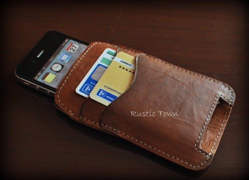
So here is the big surprise: the product I’ve decided to feature in our experiment is a handcrafted goat leather iPhone case and wallet combo, and the keyword I’m targeting is “leather iphone wallet,” which directly gets about 600 searches a month and has very good long-tail potential as well. There are also no other sellers targeting that specific keyword, so I think we can really do some damage.
It’s sort of a combination of both of our scenarios from earlier. While it’s not my own proprietary product, I am going to be creating a unique product listing since it doesn’t yet exist on Amazon. I’ll have complete control over the listing, which is nice!
The product doesn’t have a UPC code associated with it, so a little bit of Googling and I found SpeedyBarcodes.com, who sell barcodes individually and in bulk. One barcode cost $5. Not bad, I suppose. I entered the new barcode into Amazon… abracadabra, a new unique product listing.
You can see the listing here.
I’m still working on getting more images of the product. However, the listing has all of my customizations, including my keyword-rich description and title, so now we can finally move on to the next step, which is to build links and get some organic traffic flowing to the page.
What do you think? Make sure to leave us your comments below on the process so far!


33 thoughts on “#AmazonDomination Pt. 3: Creating A Unique Product Listing”
Nice post, Shabbir! Looking forward to the next one on driving traffic and page views. 🙂
Nice post, Shabbir! Looking forward to the next one on driving traffic and page views. 🙂
Nice post, Shabbir! Looking forward to the next one on driving traffic and page views. 🙂
Hi Shabbir,
I don’t know if you know this, but it’s against Amazon’s TOS to create a new listing for the product that is already listed on Amazon. You can only have one listing per product.
Hi Kris,
Thanks for pointing that out – I wasn’t aware of it. I’m going to cross my fingers and hope Amazon doesn’t notice my listing for the duration of this experiment!
Even if you add your offer to an existing listing, you can still use the same principles to bump up and cement your particular product in search rankings.
I suppose the lesson to be learned here is to find really small suppliers that probably don’t have their products listed on Amazon already, or better yet, make your own unique product.
when is the 4th part showing up? its been a while already
Hi there, part 4 will be coming in the next couple weeks. We want to make sure we have enough data to draw statistically significant conclusions.
Thanks a lot 🙂 looking forward for it.
when is the 4th part showing up? its been a while already
Hi there, part 4 will be coming in the next couple weeks. We want to make sure we have enough data to draw statistically significant conclusions.
Thanks a lot 🙂 looking forward for it.
when is the 4th part showing up? its been a while already
Hi there, part 4 will be coming in the next couple weeks. We want to make sure we have enough data to draw statistically significant conclusions.
Thanks a lot 🙂 looking forward for it.
Hello, I had a questions In the keywords tab where we have 5 lines, can we enter more than one keyword per line if it’s separated by commas?
you can add upto 255 letter in every lines and unique keyword u have write — these are enough lines for writing keywords… if u have still confusion or questions.. please skype ‘narajani’ thanks
Hello, I had a questions In the keywords tab where we have 5 lines, can we enter more than one keyword per line if it’s separated by commas?
Hello, I had a questions In the keywords tab where we have 5 lines, can we enter more than one keyword per line if it’s separated by commas?
Pingback: 15 Persuasion Lessons You can Learn From Amazon’s Upsell Strategy | Neil Patel
Pingback: 15 Persuasion Lessons You can Learn From Amazon’s Upsell Strategy | Neil Patel
Pingback: 15 Persuasion Lessons You can Learn From Amazon’s Upsell Strategy | Neil Patel
Very helpful information, thank you!
Very helpful information, thank you!
Very helpful information, thank you!
Pingback: 15 Lições de Persuasão que Você Pode Aprender com a Estratégia de Upsell da Amazon
Pingback: 15 Lições de Persuasão que Você Pode Aprender com a Estratégia de Upsell da Amazon
Pingback: 15 Lições de Persuasão que Você Pode Aprender com a Estratégia de Upsell da Amazon
Nice information, am having years of experience in Amazon, if anybody need help in selling or listing please contact me at skype ‘narajani’ thanks
Why is the link down? Did the UPC not work?
Comments are closed.