For business owner and email marketers, establishing a vibrant and effective Welcome Series is an essential first step in attracting and keeping customers.
You never get a second chance to make a first impression, after all, and having an engaging welcome email series is the best way to show potential customers what your company is all about.
Remember, your welcome email series is the first real interaction you have with many of your potential customers. They may have seen your Facebook ads, or skimmed through your website, but a lot of them still don’t really know what it is that separates your business from the competition.
An engaging, well-constructed email welcome series can effectively communicate that information for you – and it can win you a lot of new business in the process. This series is even placed in the #1 spot on Neil Patel’s list of 7 email automations every Ecommerce store needs.
So it must be important!
It’s the crucial introduction, pre-sell and relationship building tool you need to create interest in your business. And for many brands, the welcome series is the top revenue driving email automation.
With a little time and creativity, you can turn this email sequence into a consistent source of revenue and new customers.
Let’s take a look at the essential parts of a winning welcome series.
An Ever-Increasing Subscriber List
Before we break down the actual layout of your welcome series, we need to make one thing abundantly clear:
Your welcome sequence will not drive any significant amount of revenue if you’re not continuously sending people through it.
If this sounds remedial to you, good – that means you take list growth seriously.
If you’re not actively trying to grow your list, though, you need to allocate some time to doing so ASAP. These strategies won’t make a lick of difference to the performance of your welcome series if you’re not constantly funneling new subscribers into it.
There are two basic ways most ecommerce owners gain email subscribers who have not yet bought from them:
1. By relying on the user to scroll all the way down to the footer of their website and enter in their contact info
2. By placing an opt-in form directly in front of their visitors in the form of a popup
Which approach do you think consistently produces the highest conversion rate?
Popups.
And by a landslide.
There’s a reason 40 of the biggest brands in the world use some form of popup or another to increase their conversion rate: they work.
But the extent to which they work depends on how thoughtful you are in creating them.
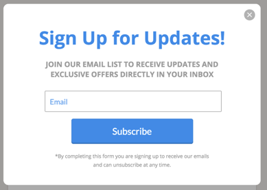
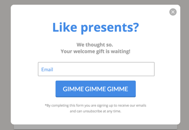
Take a look at these examples.
The first is a very standard newsletter opt-in form; the second is a more unconventional version of the same thing.
While they both are trying to achieve the same end (getting more people to subscribe), there are a few key differences that you should pay attention to if you want to create a highly-successful opt-in form of your own.
1. Headline Text
Popups are much more common than they used to be and thus less likely to grab the same kind of attention they did ten years ago. To remedy this, you need headline text that keeps visitors interested enough to not default-close your popup. Using a boring headline like “Sign Up for Updates!” isn’t going to cut it.
2. CTA
Think outside the box with your CTA. Words like “Subscribe” or “Submit” can carry a negative connotation because they imply commitment on the part of the user. They’re also incredibly boring. While the tone in the second CTA example above won’t work for every business, it’s a good example because it’s different and makes the user want to hit the button, in part because it’s written in the first person but more importantly because it hints at a signup gift.
3. Incentive
Which sounds more appealing to you: updates or presents? The presence of a defined incentive in the second form (“Your welcome gift”) makes it much more likely to convert than the first version. Telling people exactly what the incentive is, for example 10% off your your first order, also works extremely well. In fact, most brands use this approach.
If you can afford to do so, we strongly recommend using a discount or free gift as an opt-in incentive.
Creating the Perfect Popup – Incentivize and Test Frequently
People are getting increasingly protective over their inboxes, which makes tying an offer to your sign-up form so necessary.
The offer doesn’t have to be crazy—10-15% off the first purchase should work—but you need to give potential customers a reason to divulge their contact information (this can also profoundly help turn new subscribers into loyal purchasers, by the way).
Once you’ve decided on the offer you’d like to extend to anyone who subscribes to your emails, you’ll want to conduct split tests to determine what sort of copy, content, and popup triggers work best with your audience.
We’re partial to using exit-intent triggers because they’re relatively unobtrusive, but the only way to determine what’s truly optimal for your brand is by testing. Isolate one variable, test two different versions, declare a winner, and move on to the next. It’s pure Darwinism—only the strong survive.
Repeat this process frequently enough and you’ll have a reliable, high-converting opt-in popup in no time.
The Emails
Email #1: Get to the point
When people opt-in through your incentive-laden popup, they don’t want to stare at long paragraphs of text in the follow up email rhapsodizing about how terrific your company is.
They want the goods.
They want the discount.
And they want it now – so give it to them. Immediately.
Configure your first email so that the very second a new subscriber joins your list, it’s sent to them with the coupon code prominently displayed. Include a brief thank you/welcome note at the end and leave it at that. You can see some examples of winning welcome email designs here.
(Note: It’s a good idea to set the code to expire anywhere from 2-14 days after issuance and to let the customer know that. This will help build urgency throughout the rest of the sequence.)
And make sure the code appears as text, not just overlayed on a graphic, so it can easily be copied on a mobile device.
Email #2: Introduce yourself
Your first email was short and sweet, giving a quick introduction while providing the incentivizing discount code. Now you can take some time to provide background on your company and to officially welcome new subscribers to your family or tribe or whatever affectionate term you use to describe your group of customers and subscribers.
Use your second email to highlight your USP and to begin to establish the specific tone you’ll be using in all future communications.
You really want to develop a distinct personality for your brand that will be readily identifiable to your subscribers. This will make them less hesitant to purchase products from a new source, as they’ll feel they actually know who you are as a company.
Use Smart Automation
Before we get into the nitty gritty of what sort of content to include in these next few emails, we’re going to take a second to emphasize the importance of using smart automation to ensure any emails you send are relevant to where your subscribers are in the buying process.
Let’s imagine someone hits your website, subscribes to your list, receives the discount code, and immediately uses it to make a purchase. Should they then receive the next four emails in your sequence that remind them to use the discount code before it expires?
No. A thousand times no.
Not only will those emails be irrelevant, they’ll also be annoying. They’ll make your company look amateurish and unprofessional, and they’ll jeopardize your ability to maintain that customer’s trust and loyalty.
You want to capture their attention (and business) with the fewest amount of emails possible. Yes, conveying your brand’s value and USP are important, but if a subscriber purchases from you the second they get your welcome discount, you don’t really need to continue selling yourself – they’re clearly picking up what you’re putting down. Don’t blow it by flooding their inbox with irrelevant messages!
Most ESPs have intuitive filters that make it simple to exclude purchasers from receiving unnecessary emails, regardless of how many total emails are in your welcome sequence.
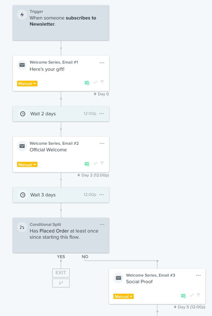
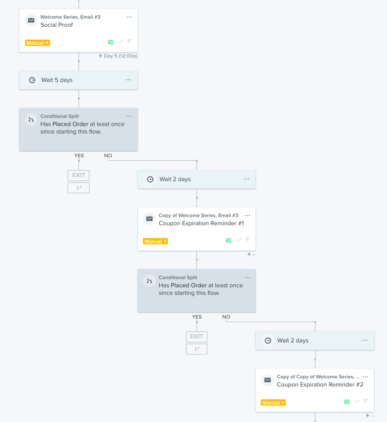
Let’s take a look at how we can use a conditional rule to filter out anyone who’s made a purchase from receiving the next two emails in this series. We’ll use Klaviyo for this example, a favorite tool of many Ecommerce email marketing specialists, but any good ecommerce ESP will possess similar capabilities.
By using a conditional split based around the “Placed Order” metric after the second email, we’re able to filter out anyone who’s made a purchase after beginning this welcome sequence.
Depending on the content in your emails and in your other automations, you can put the split after first email too. It is sensible to send people down a different path immediately after the first purchase in most cases.
Lastly, if your ESP supports this as Klaviyo does, you could add a filter to the entire sequence that automatically removes anyone who purchases, regardless of what stage they’re at.
This is incredibly useful in helping achieve our goal of sending the minimum number of emails required to convert a subscriber to a customer.
We’ll repeat this process for the following two emails.
This kind of conditional logic is easy to implement in your email sequences and will help keep your emails relevant to your recipients. And again, if you don’t want to set up these different exit points, just apply a filter to your whole sequence to remove buyers as a more blanket approach.
Email #3: Social Proof
If a subscriber hasn’t made a purchase after receiving the first two emails in your sequence, they likely still need some convincing that your products are as great as you claim.
Who better to convince them of this than your existing customers?
Take your third email as an opportunity to showcase some of your best reviews, either of your hero product or a number of items in your collection.
Don’t just focus on mere star rating here, focus on the content of the review. Try to showcase testimonials that highlight how your product has helped solve a particular problem or proved itself superior to a competitors’. If the reviewer included a photo with their review, include it in the email to give your subscribers an idea of how they too might put your items to use. Include clear call to action buttons that link directly to the featured product page where possible.
Email #4: Product Benefits + Urgency
If a subscriber hasn’t been filtered out by purchasing at this point, they need further convincing.
Use this fourth email to highlight and describe some of your best-selling products. Include high-quality photography, clear CTAs, and remind your subscribers that their coupon grants them X% off – but that it’s going to expire soon. Creating urgency is a great way to nudge these hesitant would-be purchasers across the finish line.
Email #5: Urgency, urgency, urgency
Now it’s crunch time.
Your new subscriber has already received four emails from you and remains steadfastly unmoved by your offer. What now?
Let them know that their discount will expire in just a few hours, and once that midnight hour hits, their opportunity to save on that fantastic product will be gone for good.
If they’re on-brand, use phrases that connote a sense of urgency—“don’t be left behind,” “you’re missing out,” “your last chance at a great deal,” etc.–while reinforcing the expiration time.
While you need to hammer home the fact that the discount is going to expire very soon, don’t lose sight of the fact that at the end of the day you’re selling a product – not your discount.
Remind subscribers of what makes your products different and if you have a warranty or no-questions-asked return policy, mention it. Perceived risk is one of the key factors that prevents people from buying from unknown brands, so by addressing it head-on you may be able to overcome this common obstacle to purchasing.
Final Thoughts
In addition to split-testing your opt-in form, you should also remember to be constantly conducting tests throughout the entire welcome series itself.
Factors like content, subject line, email frequency, CTA, and discount-offering will play a big role in determining how well your welcome series performs, and you should continue to test them to see what strategy is most effective.
There’s no shortcut to determining what’s best. Just use best practices as a starting point then prepare for lots of vigilant testing and re-testing. And make sure that whatever decisions you make are accurately represented in your series – you don’t want to tell customers they have 48 hours to redeem a coupon code and then remind them three weeks later that time is running out. It’s important to be consistent with your email series; keeping your series relevant will do much to ensure customer loyalty and subscription rates.
Finally, don’t rush through setting up your welcoming sequence without some deliberate thought and strategy. This is a powerful chance to make a lasting impression for potential customers, so take your time. Make sure you have the right popups in place for your series.
You might not get everything right the first time around, but consistent split-testing will help you get to where you want to be.
There’s no one-size-fits all strategy to email marketing, but by following the steps in this article, you will be well-equipped to make a welcome series that can turn new subscribers into paying customers. Good luck!
