My co-founder, Max, and I started our eBay business from square one, and in two years were winning eBay awards for the highest conversion rates and bringing in more than $100k a month.
For those of you who are just starting out and trying to grow your online business from nothing, here’s a peek into our process to inspire you and help you take your own business into the $100k+ per month range as well.
There’s a difference between beautiful and high-converting
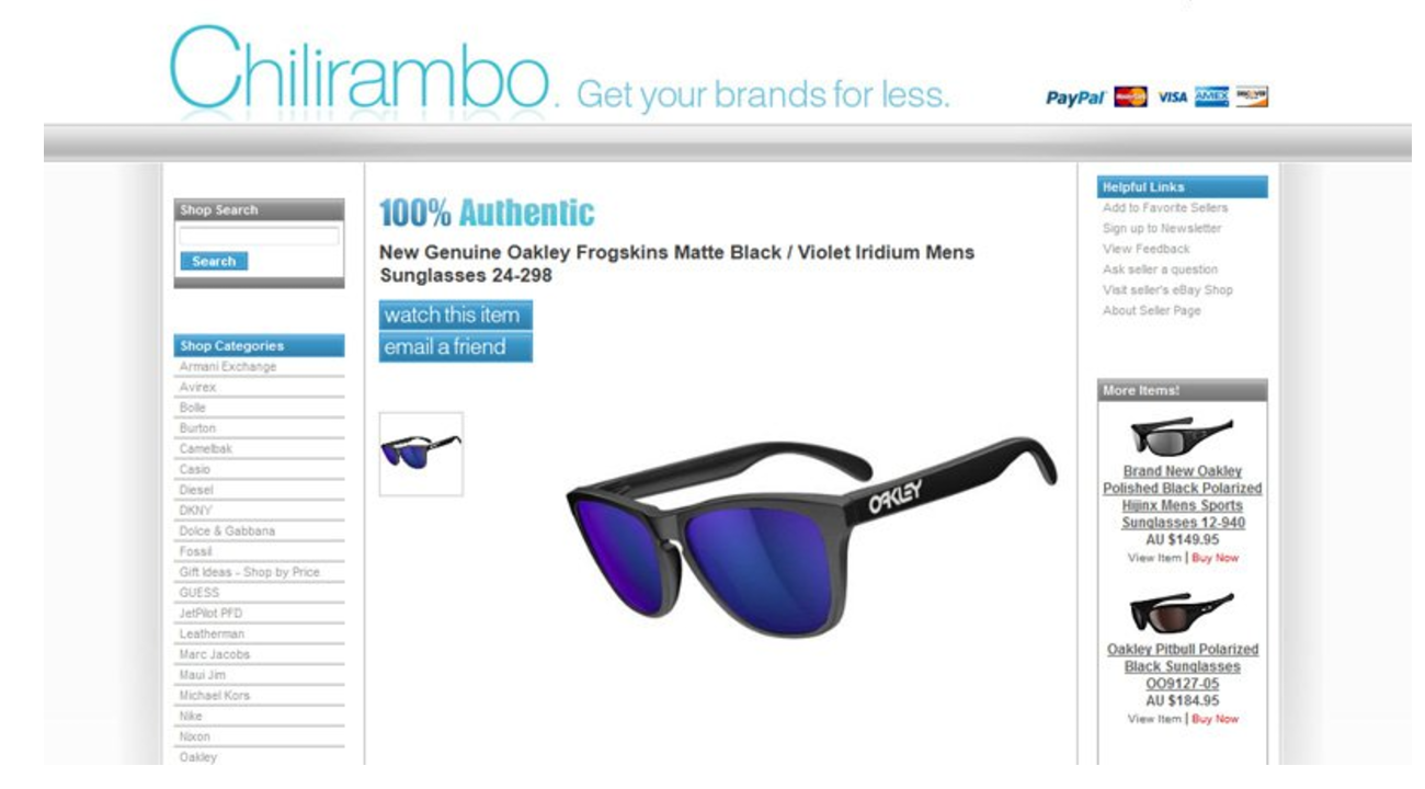
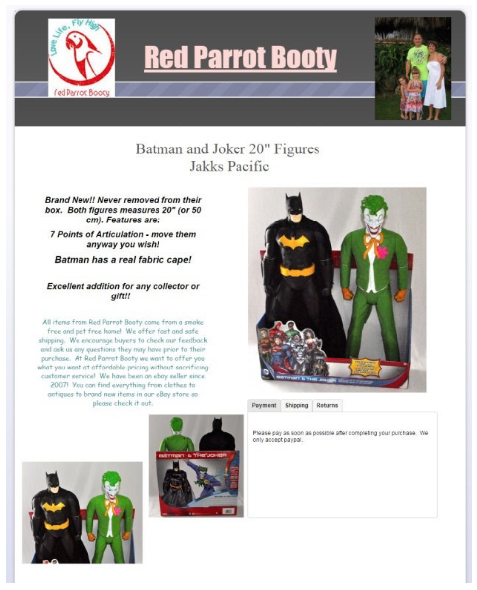
I think we can all agree this eBay listing, created by a professional agency, is well-designed. But the goal isn’t to impress a listing’s visitors with beautiful design, it’s to convert them into paying customers!
This listing belongs to a colleague of ours, and when he asked for our help, it quickly became apparent that his business model is to sell high volumes of branded items with low profit margins. The first thing we did was analyze his communication with customers, and we noticed a lot of questions in the spirit of “The price is so low! Is this genuine?,” “Is this original,” etc.
After this insight, we made one small addition to the listing—a “100% authentic” badge.The results were a 37% uplift to sales and conversion rate, and a significant decrease in the time he spent answering questions about the item’s authenticity.
This example perfectly demonstrates the difference between a listing that is only beautiful and one that is also high-converting.
Treat listings like an ongoing process
Most merchants dedicate the majority of their focus on a listing’s creation, giving a lot of attention to every pixel and every font, but completely forgetting about the listing once it’s gone live.
What’s wrong with that?
At the time of creating the listing, you have very little data to support your design ideas. You don’t really know if your customers will worry more about the authenticity of your item or if you ship worldwide.
At best you’re basing your listing design on best practices that might have worked for a different business, a different segment, or a different category. At worst, you’re just basing your design on your own beliefs and gut feelings.
Creating a listing is just the start
We were selling car GPS devices and, realizing early on that we don’t know much about what customers looking for a GPS want, we were hungry for input.
We showed our listings to family and friends, asking for input and ideas for improvement. We carefully analyzed questions from our visitors, trying to distill what info was not clear enough and what needed to be emphasized.
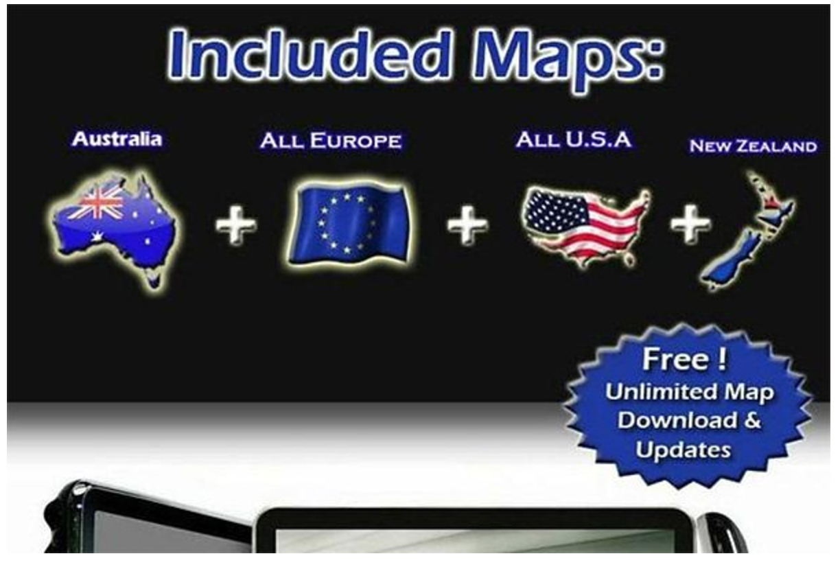
For example, Australian visitors asked whether the GPS had a map of Australia pre-installed. We actually had a big list of pre-installed maps, but guess what? Modern customers have an attention span of 6 seconds. If you ask customers to read through lists of information—“a wall of text”—they will simply give up.
In this situation, we learned that the fact that a map of Australia was already pre-installed was not clearly conveyed on the listing. Based off the fact that people process images 60,000 faster than texts, we added an image showing a map of Australia and clearly stating that the map was already installed.
Once we did this, sales and conversion rates went up, and the number of questions about maps decreased!
It’s virtually impossible to guess what your potential customers are looking for in your listings, which means that treating your listing as a one-time creation with no follow-up analysis is basically leaving money on the table. There is always room for improvement!
Takeaway
Creating a listing is just the start! You should treat your listing as an ongoing process, and it should be constantly optimized according to new learnings.
Carefully listen to your potential customers; they will usually tell you what critical information is missing from your product listings. Adding this info in an easy-to-comprehend way—usually visuals—is highly likely to grow your sales.
How to get ideas for improving your listing
Competitor feedback and listing descriptions
Examine your competitors’ feedback profiles. What are they praised for? What do they receive negative feedback for?
Look at your competitors’ listing descriptions. Can you make yours more appealing, better looking, and higher converting?
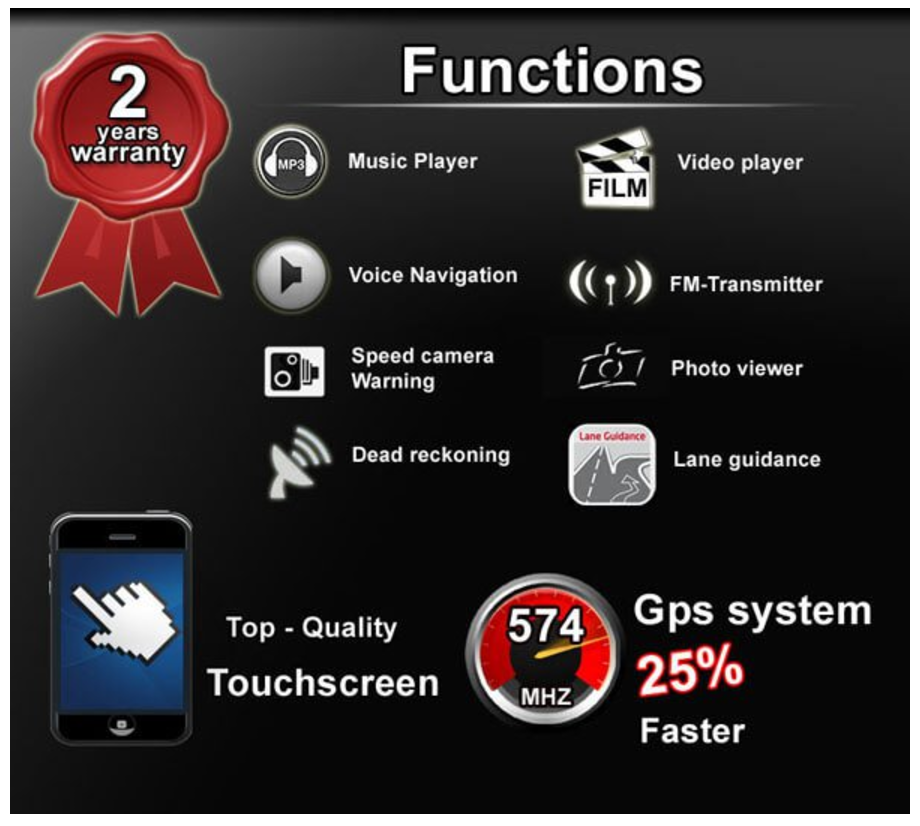
Looking at our competitors’ listings, we noticed they offer a 1-year warranty period for the GPS. Understanding that this was an important aspect for potential customers, we mentioned a 2-year warranty in our listing description.
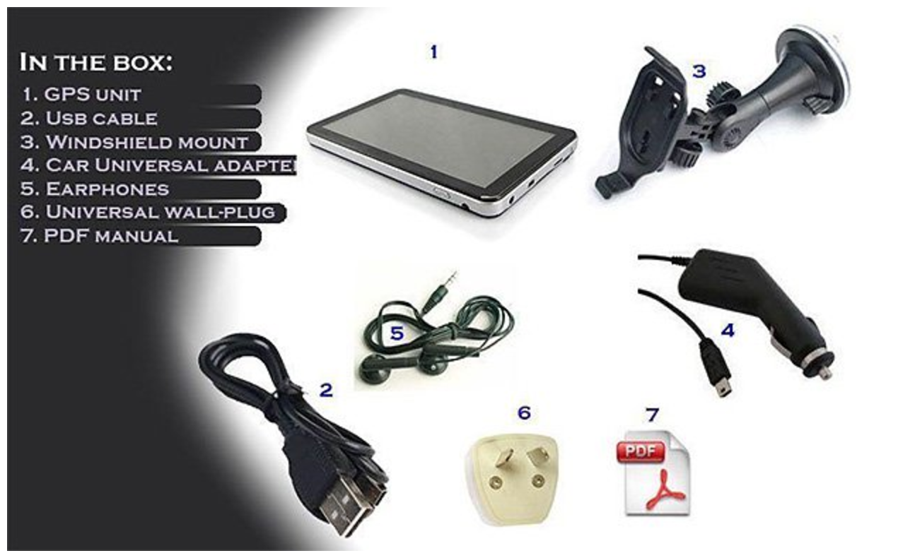
We also noticed that most of our competitors were adding a text list of the box content. Knowing that potential customers don’t like to read and respond better to visuals, we actually showed the content of the box, thereby shortening the virtual gap between the customer and the product.
And again, the clearer the listing became, the less time we had to spend on customer support and the higher the sales and conversion rates grew.
Listen to your customers
As I said above, reviewing and analyzing your correspondence with customers will give you ideas for improvement.
You should be thanking customers who bother to reach out to you when something is unclear on your listings. For every customer who makes an inquiry, ten others simply don’t care and continue to the next seller.
Use Mturk
Amazon’s Mechanical Turk is a micro-works marketplace, where you can pay a few cents for tens, hundreds, even thousands of people to give you insights about your listings.
One important tip here is to ask direct, accurate questions like:
“What is ONE thing you’d change to improve this eBay listing?”
Ask F,F&F
Just like with startup investments, first go to Friends, Family, and Fools.
Be very mindful that their input is biased and they will usually avoid offending you with honest, harsh feedback. But even from the input you get you’ll usually uncover some obvious listing mistakes. It never hurts to hear a few additional opinions.
Indicators of trust and social proof
At first we were shy about the fact that we were basically two guys running a small eCommerce business, so we hide behind our eBay listings, stating that we are an “international business” with offices around the globe, i.e. every country where we had a dropship supplier.
It took us time to realize the truth is much more powerful and appealing.
Look at this guy, he actually added an image of his whole family!
It makes me trust him and feel confident doing business with him. In fact, knowing that I’m dealing with a “one-man-show” business makes me feel much better than buying from a big business. I’m speaking directly to the CEO and owner; his whole business relies on making me happy, which gives me the most chance I’ll have an awesome buying experience.
Who would you rather shop from: a seller who has hundreds of happy customers or one without any customers? A social proof is a psychological phenomenon where people assume the actions of others in an attempt to reflect correct behavior for a given situation, and this is exactly how it works. You need to show your new potential customer that you already have other happy customers. This is not the place to be shy, if you have tons of happy customers make sure to brag about it on your listings. If you only have a few happy customers, that’s perfectly fine. Reach out to them and ask for a testimonial, and aim for quality rather than quantity.
Out of 40k+ CrazyLister users, we placed testimonials of 3 people on the homepage. We added their images (with their approval), and it made a major impact!
We hear from a lot of new users that the reason they signed up with CrazyLister are the testimonials on the homepage.
Attention-grabbing heading
Research shows that the attention span for looking at a webpage is currently around 6 seconds and it continues to decline! Which means that you have 6 seconds to grab a customer’s attention on your eBay listing and make him read your description.
Your strongest weapon for this is the heading or the top of your listings. This is where you need to convey a strong, focused message.
STOP! This is the best deal for hair straighteners on eBay!
Guaranteed by 1500 happy customers
This is where you must rise above all other listings; be unique and interesting! Give them a reason to continue reading.
Try bold statements, use visuals showing whales flying in the air.
Do whatever it takes to grab a customer’s initial attention to keep him reading through your description!
Incorporate the main reason WHY people buy from you. Are you an expert in your field? Do you offer worldwide shipping? Do you have perfect feedback? Whatever it is that makes people buy from you should be your primary focus and should be in your heading!
A word about focus: In almost every post, lecture, and almost every conversation I have about business, I encourage folks to embrace the virtue of focus. You simply can’t excel at too many things at once.
Concentrating on ONE thing and doing it better than anyone else is what drives success.
We hope these insights into our process serve as an appetizer for your ecommerce ventures and inspire you as you continue to grow your business.
Happy selling!
Have you employed any of these tactics in growing your business or do you have any advice you would add? Let us know in the comments below!
