Sales shouldn’t be the only thing you celebrate — product page visits are worth a cheer as well. They indicate that someone is well on the way to becoming a customer. They’re one of the first steps in the right direction.
These visits only happen because of a lot of work — engaging marketing campaigns, strategic pricing, and captivating, high-quality product photos. But all of that effort goes to waste if the product page isn’t carefully curated to turn warm leads into customers. As Jason Amunwa, former Director of Products at Telepathy, says:
Each visitor that makes it to a product page represents the heavy lifting and money spent to get them there. The product page is not the time to squander that hard work. It’s up to you to create a user experience that gives the visitor what they need to become a customer.
You can create a product page that motivates visitors to purchase through easy design and copy adjustments. Just look at the online retailer DueMaternity.com — adding 360-degree images to their product pages boosted conversion rates by 27%.
To get started, here are 15 best practices for building product pages that boost conversions.
Let’s dive in.
1. Use high-quality images
We’re in the age of scrolling — shoppers will rapidly move through search results unless something catches their eye.
An easy way to grab their attention? Large, crisp, high-quality photos of your products.
Great product photography builds the buyer’s trust that you need in ecommerce. The shopper can’t see the product in-person, but they can assess its qualities with a clear photo. Providing a crisp image that covers all of the product’s details makes the buyer feel confident in making their online purchase.
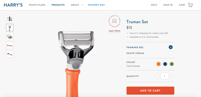
The shaving company Harry’s uses a high-quality photo to showcase the fine blades of its razor product. [Source]
For sellers on a budget, outsourcing product photo shoots can be time-consuming and expensive. As an alternative, here are a few resources for taking your own high-quality product images:
- Your DIY Product Photography Resource Guide from Volusion
- How to Capture High Quality Product Photos With Your SmartPhone from Shopify
- The Ultimate DIY Guide to Beautiful Product Photography from Shopify
- How to Take Pictures That Attract and Convert Customers from Vend
With these resources, all sellers on any type of budget can create stunning, crisp product photos that inspire confidence in shoppers and motivate them to complete their purchase.
2. Add trust badges and statements
Every week, new stories are published online about data breaches, cyber identify theft, credit card fraud, and personal information being stolen and compromised by savvy hackers. As more events occur, consumers have become more wary of distributing their personal information online — creating a barrier to ecommerce shopping.
If you want people to buy your products, you need to convince them that their information is safe in your hands. To build this trust, trust badges are highly recommended.
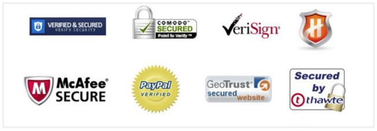
A collection of trust badges you can potentially include on your product pages. [Source]
According to a study by Econsultancy/Toluna, 48% of shoppers agreed that trust seals help them decide whether to make a purchase. Clear and visual, trust badges are an easy way to let shoppers know that their purchases are safe.
To read more about how effective trust badges can be in boosting conversions, check out these blog posts:
- 5 “Trust Badges” That Can Increase Your Conversion Rate from MonetizePros
- Why Choosing the Right Trust Seal Increases eCommerce Conversions from CrazyEgg
- Importance of a Trust Seal on Your eCommerce Website from Forbes
- Establishing Credibility with a Trust Badge Increases Conversion Rate by 72.05% from VWO
As a clear symbol, trust badges immediately build confidence in your company so buyers feel comfortable completing their purchase.
3. Leverage reciprocity
According to psychologist Robert Cialdini, people are governed by a rule of reciprocity — a universal tendency of feeling compelled to repay when given a gift. Applying this rule to ecommerce, sellers can craft their product pages with gifts that aren’t only useful to buyers, but also encourage them to reciprocate with a purchase.
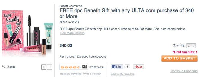
Reciprocity is leveraged in product pages with freebies. Sellers will often offer a free gift or a number of samples if a buyer completes an order.
[Source]
The free gift isn’t just a useful product for the buyer — following the rule of reciprocity, receiving the gift psychologically justifies completing the purchase, or repaying the seller, for the buyer.
To understand how applying the rule of reciprocity and other psychological principles can boost conversions on your product page, check out these resources:
- How Understanding Psychology Can Help Increase Ecommerce Sales from Search Engine Watch
- Psychology of Ecommerce Sales: Consumers and the Ecommerce Checkout from HubSpot
- How to Sell More with eCommerce Psychology from Smile.io
- 7 Proven Secrets of High-Converting Checkouts from Copyblogger
4. Highlight reviews from customers
Businesses spend large chunks of their marketing budget for promotions on Google and Facebook to encourage sales. But the truth is, the most strategic, well-placed ads are often less powerful and convincing than an alternative cheaper form of marketing: word-of-mouth recommendations.
Consider these statistics:
- 72% of consumers say positive reviews make them trust businesses more.
- 68% of consumers trust opinions posted online.
- Word of mouth is the primary factor behind 20% to 50% of all purchasing decisions.
- 84% of consumers reported always or sometimes taking action based on personal recommendations. 70% said they did the same with online consumer opinions.
Given the power of referrals, it’s best to prominently feature reviews from customers on your product pages.
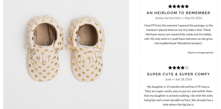
[Source]
Reviews build trust and give potential customers the reassurance they need from others to make their purchasing decisions. To feature reviews on your store, consider using these helpful tools:
- For Shopify users: Download the Product Reviews app on the Shopify store.
- For WooCommerce users: Consult this resource from the platform.
- For BigCommerce users: Consult this resource from the platform.
5. Remove the clutter
Shoppers don’t read product pages like novels — they scan them like menus. Eager to move on to more content, they’ll quickly read over your product pages looking for key information.
Keeping buyers’ attention then boils down to minimizing distracting clutter. With minimal product page content, shoppers can easily grasp the key information of your product and realize why they should purchase it.
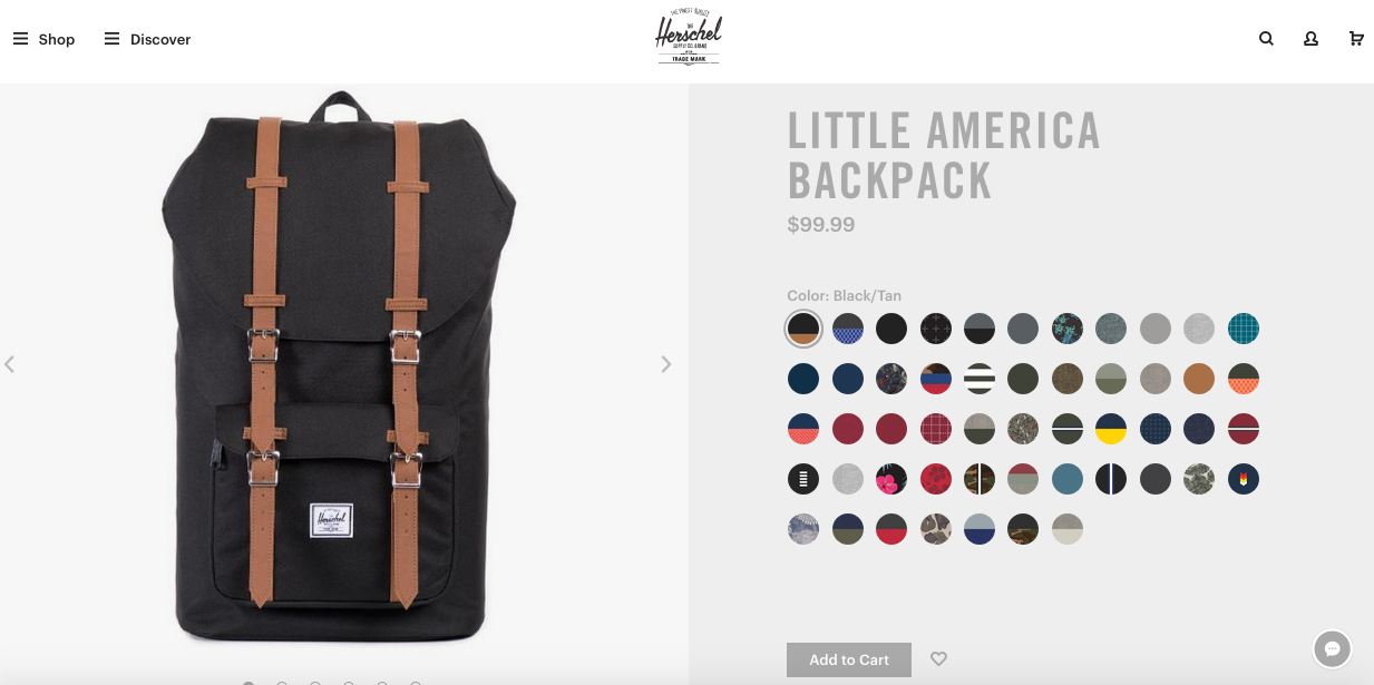
The bag company Herschel uses a minimalist design of muted colors and small color swatches to highlight the gorgeous product photo.
The trick is to include only the most essential and engaging information on product pages. To get started, here are a few decluttering tips:
- Select and highlight several large, crisp photos. It’s all about quality, not quantity. A few high-quality photos highlight your products’ strengths, while an abundance of small, grainy images is just distracting.
- Utilize negative (white) space. According to a study by Wichita State University, properly adding whitespace between content can increase comprehension up to 20%.
- Be intentional with typography, CTA buttons, and other design elements. Product page designs that don’t align with the product and brand’s aesthetic are distracting to shoppers. Make design choices that match your business’ style and don’t feel out of place so the buyer is easily guided into making a purchase.
To dig deeper into the pros of simple product page design, read this fantastic post from CXL.
6. Improve site speed
Consumers have also come to expect fast load times when they visit websites. Consider the following research presented in a Kissmetrics blog post on page speed:
- Nearly half of web users expect a site to load in two seconds or less.
- Users tend to abandon a site that isn’t loaded within three seconds.
- 79% of web shoppers who have trouble with site performance say they won’t return to the site.
To make your ecommerce product pages and website as a whole load faster, follow these recommendations:
- Reduce the number of HTTP requests that occur on your site. For every file on your product page, your browser has to make an HTTP request. The more HTTP requests, the slower your site loads. Removing unnecessary files, such as images, and reducing file sizes are both ways you can lessen HTTP requests and improve site speed.
- Fix broken links throughout your site. Product page links, such as size charts or shipping information, need to be accessible to avoid frustrating users and having them abandon pages.
- Test site speed using this tool. Then identify and remedy any additional causes of slow loading times.
Quickening the site speed of your product pages is the ultimate remedy to cart abandonment. Rather than getting discouraged with slow pages, shoppers want to keep engaging with your product pages with your site’s superior performance.
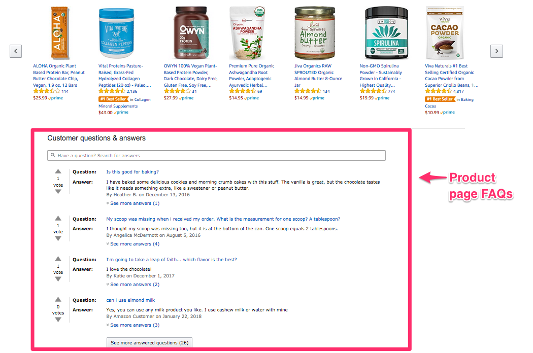
7. Use FAQs to resolve shoppers’ concerns
People aren’t visiting your website or product pages to read about how great you think your company or products are— they’re landing on your website because they need help and they’re wondering if they can get what they are looking for from you.
It’s your job to convince them that your products offer the solutions that they seek. One of the easiest ways to build shoppers’ confidence in your product is anticipating their questions and answering them in a FAQ section.
Highlighting FAQs on product pages immediately shows buyers your product’s benefits. By reading other users’ questions about the applications of your product, the shopper can begin to imagine how your item could improve their own life.
To learn more about the benefits of adding FAQs to product pages, check out these resources:
- The Benefits of an FAQ Page (And How to Do It Right) from Shopify
- Manufacturing FAQs: The Workhorse of Content and Search Marketing from Search Engine Land
Addressing FAQs on product pages quickly resolves prospective buyers’ lingering questions about your items. With greater product knowledge, they’re one step closer to conversion.
8. Zero in on your value proposition
Great products offer a clear, specific promise of value that keeps buyers coming back for future purchases. This proposition needs to be highlighted in product pages so prospective customers fully understand the benefits of buying your item.
The best place on a product page to highlight a value proposition is the item description. The rest of the page is pretty standardized — product title, images, price amount — but the description is variable enough to include the value proposition along with specific product details.
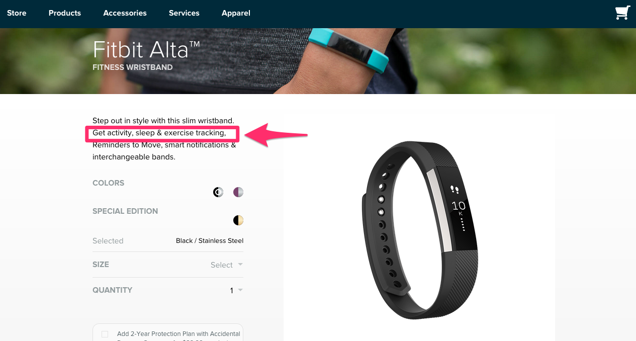
Take the example of Fitbit, an athletic watch with the value proposition of tracking and quantifying your activity. In the second line of the product description, Fitbit highlights the wristband’s tracking capabilities.
For help creating great value propositions to use on your product pages, consider asking yourself these questions:
- Who are my customers?
- What do they want?
- How can our products help them?
- What benefits do they experience with our products?
- How do our products change their lives?
- What is the end result people are looking for?
- What promise am I making to the people who buy my products?
You can also check this blog post from Peep Laja at CXL: Useful Value Proposition Examples (and How to Create a Good One). In this post, Peep really drives home the importance of thinking from the perspective of your customers.
9. Make mobile a priority
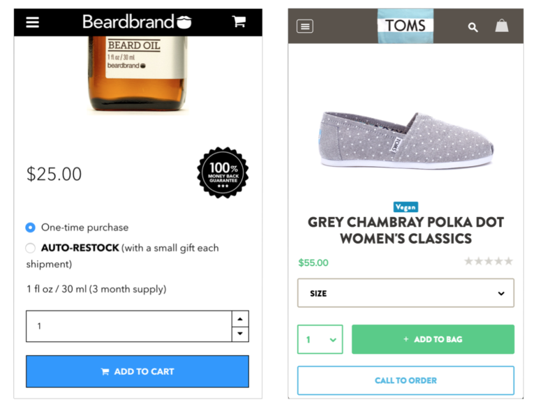
Mobile commerce has grown too popular to ignore optimizing product pages for mobile devices. In 2017, mobile commerce made up 34.5% of ecommerce sales in 2017. That figure is only expected to grow in future years. Sellers have to prepare by ensuring that their product pages properly load and are easily navigable on mobile devices with the right back-end coding and UX design.
- How Rapid Experimentation Drives Mobile ROI from Taplytics
- Designing For Mobile E-Commerce — A UX Design Challenge From Yelp by Rachit Gupta
10. Write compelling product descriptions
When shoppers read your product description, they mean business. They’re trying to quickly understand the key details of your item so they can determine whether they want to purchase it.
The product description, then, is a moment of opportunity for the seller. You want to succinctly and persuasively explain the item so that the shopper is quickly motivated to buy the product. To write descriptions that win sales, here are a few tips:
- Give important information first. There’s no guarantee that shoppers will read your entire description. In case they don’t, you’ll want the most alluring aspects of your product mentioned first to quickly engage buyers.
- Keep it short and sweet. When shoppers don’t read descriptions fully, it’s often because they seem too long. Encourage shoppers to read your description and understand your product’s benefits fully by limiting your length. Keep your description, ideally, to two to four sentences, and no more than five.
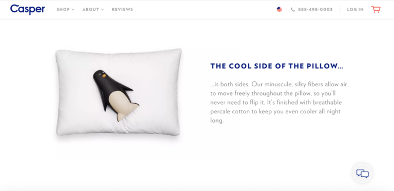
- Match the tone of your buyers. Consider the key qualities of your buyer personas and try to reflect those aspects in your product descriptions. Casper, for example, is an upscale sleep store, so the company knows its clients care about the quality of their products. Its product description below satisfies these buyers by identifying the specific factors that make the pillow cool.
[Source]
Avoid being overly descriptive, robotic, and keyword-happy. Write succinct yet engaging descriptions that help prospective customers imagine themselves using your products.
11. Generate social proof via social media
Nothing builds confidence in buyers like social proof — the psychological phenomenon of people conforming to others’ behavior because they assume it’s correct. Seeing other buyers enjoying your product convinces shoppers that your business is great and makes them feel comfortable buying your item.
Social media is the ultimate vehicle for collecting social proof. Platforms like Facebook and Instagram make it easy to connect businesses with their customers. Outside shoppers looking at your product page will be driven by positive interactions with your company and customers to explore your products more and potentially make a purchase.
Here are a few ways to generate social proof via social media on your product page:
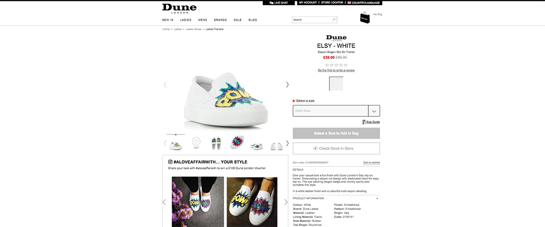
- Highlight photos from a User Generated Content (UGC) campaign. Companies will include a bar of images from their UGC campaign that features customers with their products. The shoe company Dune, in the example below, features customers’ images from their Instagram UGC campaign on their product page.
[Source]
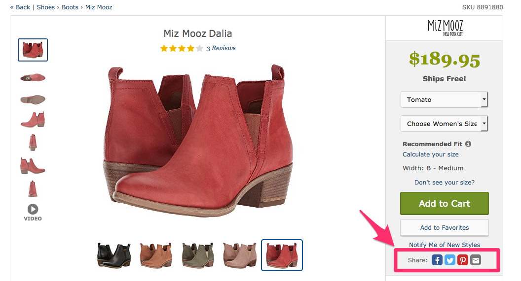
- Add a social media share bar to your product page. These bars are more discreet, yet they still allow shoppers to gauge other buyers’ opinions of your products. They can share an image of the item they’re considering buying, and their friends and family can weigh in on whether they think it’s a good purchase.
To add a social media share bar, it’s easiest to use a tool like SumoMe Share. No coding skills required — you just use a drag-and-drop editor to place the share bar where you’d like on your product page.
12. Play into buyers’ FOMO
FOMO, or the “fear of missing out,” is mostly known as a social media term — but it can also be utilized on product pages to drive shoppers’ purchases.
Highlighting the scarcity of items creates anxiety in buyers that motivates them to make a purchase. Seeing how few products are left, the shopper feels as though they’re going to miss an opportunity to buy the item if they don’t purchase quickly. To relieve the anxiety, they buy your product.
Playing into this FOMO, there are a few ways you can highlight scarcity on your product pages:
- Indicate how many items are left. Showing how much of your supply is left puts pressure on shoppers to buy before the product sells out.
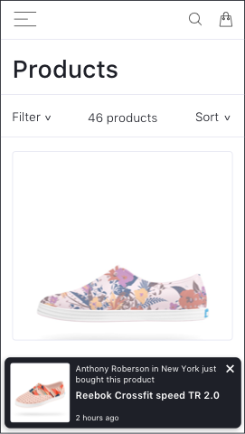
- Have a pop-up bar when someone makes a purchase. Install a tool, such as UseFomo, that notifies shoppers when other buyers are making purchases. Seeing this activity will inspire FOMO and push the shopper to not miss the opportunity to purchase by also buying the product.
[Source]
- Emphasize when an offer is limited. Including phrases like “Back today!” or “Limited time offer!” encourages shoppers to purchase your product quickly since they know it won’t be offered forever. At the same time, not stating the end date of the offer pushes shoppers to buy extra quickly since they don’t know whether it will end in the near future.
Highlighting scarcity to play into FOMO puts a bit of pressure on visitors — it urges them to make a purchasing decision faster before leaving your site.
13. Educate shoppers to build confidence
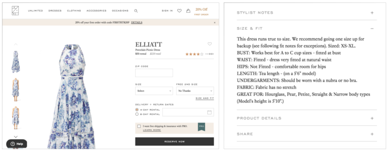
Just like a FAQ section, providing extra educational content about your items on product pages builds buyers’ confidence in your product. Reading more details about the product and advice on how it should be ordered makes the shopper feel more comfortable completing their purchase.
The clothing site Rent the Runway, for example, includes sizing and fit notes so buyers feel ready to buy the dress without trying it on.
[Source]
Adding additional educational content about your product secures buyers’ trust. Here are a few suggestions for providing extra context around your products:
- Describe the different uses of the product. Shoppers don’t always understand items at first glance. Explaining the less-obvious uses of your product will make it seem even more useful and beneficial.
- Include every product detail. There are shoppers out there who want to know every product detail before making a purchase. Including all product information — measurements, material types, weight — makes shoppers feel comfortable buying the item.
- Keep information organized. Throwing a bunch of details at shoppers without any clear organization will leave them confused. Categorize the educational content around your product so it’s easier for shoppers to comprehend and remember. The luggage company Away, for example, organizes their product page content by feature.
Reading your company’s expert opinion and extra product details, shoppers can fully imagine using your product and are ready to make their purchase.
14. Add extra rating features
Product star ratings are widely used because they’re a quick form of social proof. While they’re always useful, there’s no need to stop at star ratings — you can include even more social proof on product pages with additional rating features.
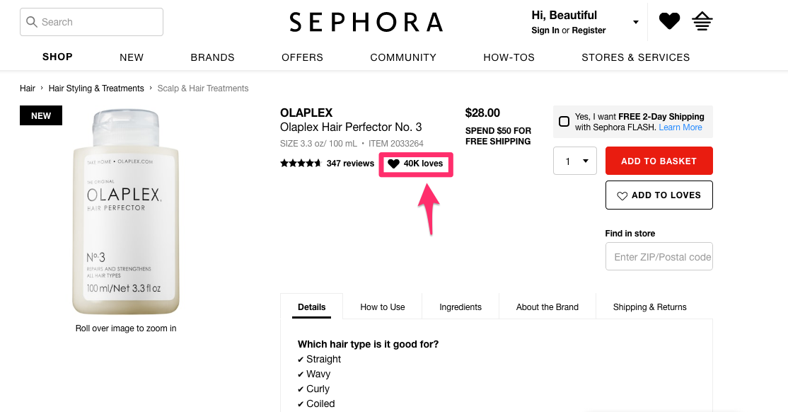
A highly popular rating system is allowing shoppers to “heart” your product.
Hearts are a powerful rating feature because they’re simple and quick, yet meaningful. Rather than taking the time to judge the product out of five stars, shoppers can quickly say whether they like the product or not with a heart. Seeing how many hearts the product has received, shoppers are motivated to buy the product.
Beyond hearts, here are a few other types of ratings you can include in a product page:
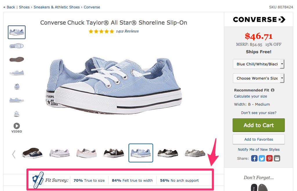
- Include customer fit survey ratings. Apparel and shoe companies, like Zappos, indicate how customers rated the fit. For example, they indicate whether they felt it was “true to size.”
- Indicate how many social media likes and shares the product has received. Showing how the product has been well received on platforms like Facebook, Twitter, and Instagram builds buyers’ confidence in your product.
15. Have a clear call-to-action
Out of all of the product page elements — product photos, descriptions, price — the most important is your call-to-action — the button that lets the shopper start their order. If the CTA isn’t highly visible, shoppers may get distracted by other elements and fail to complete their order.
To encourage more sales, make your CTA button stand out with these tips:
- Choose a bold color. Select a color for your CTA button that is bright or stark enough to catch shoppers’ eyes. It’s best to use a different color for other buttons on the page so that buyers aren’t misled to those buttons.
- Keep it large. Make your CTA button the largest button on your product page. If needed, you can have one or two other buttons that are the same size, but not larger than the CTA.
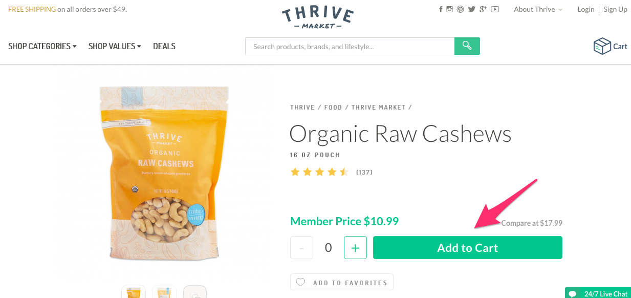
- Play with contrast. Using contrasting colors in your CTA will make the button pop on screen. The grocery shop Thrive Market, in the example below, uses a white font against a neon sea green button to make their CTA especially noticeable to shoppers.
By designing your CTA to stand out, you direct shoppers’ attention to exactly where you want it — completing their checkout and making a purchase.
Curate Your Product Page for Greater Conversions
As an online seller, the product page is your final moment to win the sale. You’ve developed a great product, you’ve launched engaging marketing campaigns — now you just need to win over shoppers one final time on the product page. If you can show buyers the benefits of your products on this page, they’ll complete their order and give you a sale.
You can easily craft a product page that drives conversions by using the tips in this guide. With a few design and copy adjustments, your product page will keep shoppers engaged and gradually lead them towards completing their purchase.
Note: This post was originally written by Alex Birkett but was updated on March 15, 2018 by William Harris.



1 thought on “15 Best Practices for Boosting Product Page Conversions”
In addition, I think the most imperative thing for boosting product page conversion is optimizing the product listing. It is necessary to include relevant search terms for product and be focused on optimizing listing for both Amazon and google searches. But it will not be finished after optimizing listing only. Because Google’s algorithm changes frequently. So it needs to revisit and test by using such kinds of tools like Splitly to conduct A/B testing on pricing, images, titles, features, descriptions and keywords.