If you want to create a successful ecommerce business in 2018, you have to be willing to compete with other business owners like yourself. We live in an exciting time period—it’s never been easier to create and launch an ecommerce brand than it is today. As more people leave their traditional 9-5 jobs to create and grow ecommerce businesses, it’s up to you to do what you can to make sure that your business stands out from all the others that pop up in your space every month.
Consumers today have more options to choose from than ever before. It’s no longer big business against the small mom and pop shop—it’s everyone against everyone. The playing field has been completely leveled.
As a business owner, you have to work harder than ever to reach your target audience, successfully engage with and nurture them, and convince them to buy products from you.
Your website is an important tool in the never-ending battle for customer loyalty and conversions.
A well-designed ecommerce website can put you at the front of the pack in your industry, while a poorly designed website can leave you in the dust and struggling to survive.
So, the question is, what makes an ecommerce website great? Here are 13 essential components that you need to work into your website in order to retain visitors, boost engagement, and drive conversions:
1. Rich Photography and Video
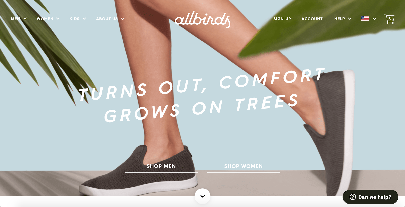
To drive engagement and sales for your ecommerce business, you need to place rich, high-quality photos throughout your website. As I’ve mentioned before on this blog, your prospective customers don’t usually have the opportunity to see, feel, or try your products in person before they buy. As a result, you have to work harder than the traditional brick-and-mortar retailer to build trust with people and convince them that your products are worth buying.
That’s where photos and videos come into play. They allow your website visitors to see your products up close and make it easier for them imagine what it would be like to own and use your products in daily life. The right photos can also help you build a distinct brand that looks and feels different than your competitors.
Recommended Resource: The Ultimate DIY Guide to Beautiful Product Photography from Shopify
Source: Allbirds
2. Compelling Headlines
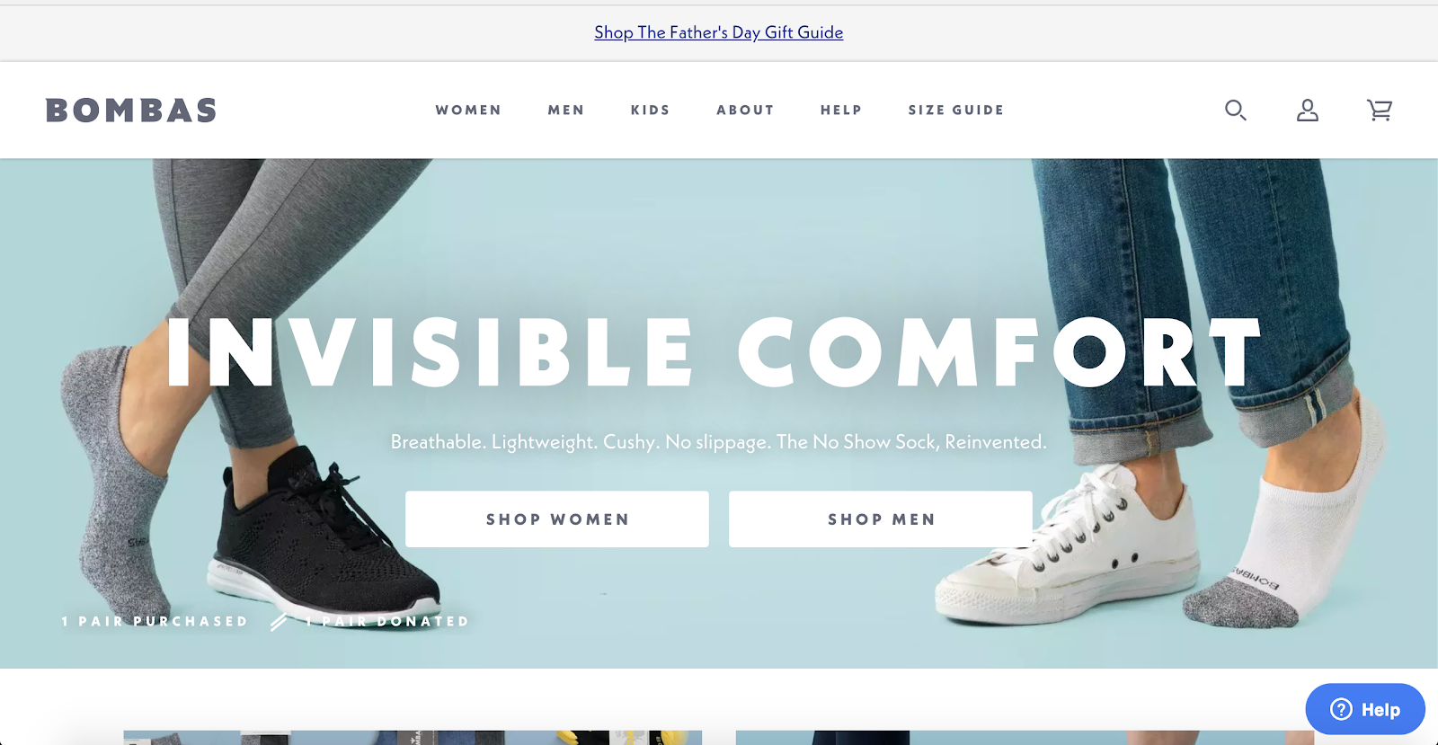
In ecommerce, you only have a few seconds to convince people that they should stay on your website and spend more time exploring and learning about your products. Photos and videos will help convince them that your site is worth their time, but it’s only half of the equation. You also need to incorporate compelling headlines on your homepage that help people understand what to expect and what they will get if they stick around.
To write compelling headlines, think about who your audience is, what they are looking for, and how your products help solve their problems. Focus on what makes your brand and your products unique.
Recommended Resource: How to Write Copy that Converts: an Ecommerce Guide from Sellbrite
Source: Bombas
3. Distinct CTA Buttons
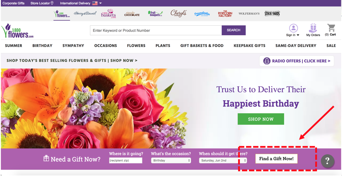
To get your visitors to explore past your homepage, you need to design distinct CTA buttons that entice people to take action. A well-crafted CTA button utilizes color, size, placement, and language to persuade visitors to take whatever action you’re trying to get them to take. To design CTA buttons that boost conversions with your specific audience, you need to be willing and able to test different variations using tools included with your ecommerce website platform, or a 3rd-party tool like Optimizely.
Examples of common CTA button tests you can run on your website include things like making a button bigger or smaller, using a brighter color or one that offers more contrast, or using contextual language that helps your audience understand what you want them to do (like the 1800Flowers example below).
Recommended Resource: How to Craft Ecommerce CTAs That Convert from Bigcommerce
Source: 1800Flowers
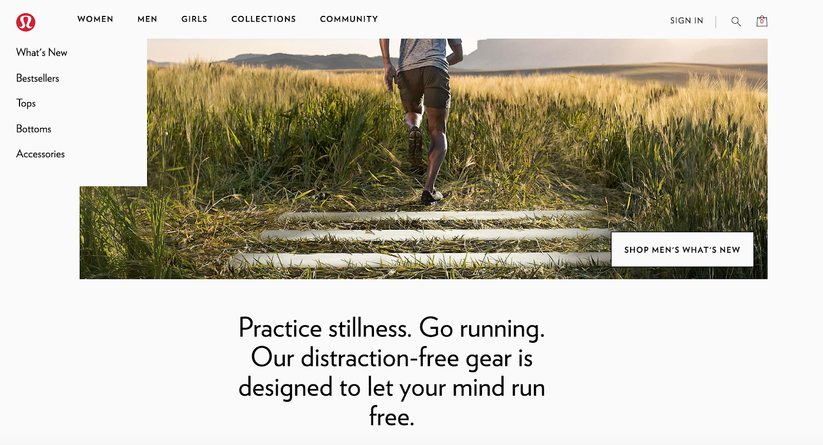
4. Benefit / Promise Statements
As mentioned above, language and messaging can play a big role when it comes to the overall success of your ecommerce website. You can have the most visually-beautiful website in the world, but it won’t mean anything unless you can pair it with language that connects with your audience, builds trust, and convinces people to buy your products.
To achieve all those things, you need to make an effort to include benefit-focused language on your site in addition to the feature-focused language that you likely already have. Not sure what the difference is?
Feature-focused content helps visitors understand what makes a product unique (example: this running shoe is made with lightweight material).
Benefit-focused content helps visitors understand what a product will do for them (ex. run faster and farther than you ever have before).
Recommended Reading: Features vs. Benefits: What’s the Difference & Why It Matters from WordStream
Source: lululemon
5. Mobile-Friendly
As more and more consumers use their smartphones as their primary online shopping devices, it’s important that you ensure that your website design is not only beautiful and compelling, but also 100% accessible from mobile devices.
If you’re using a template or theme from an ecommerce platform, it’s likely that your website is already mobile-friendly. If, however, you have a custom-built website or you’ve deviated at all from your original template by adding additional customization, you need to ensure that your visitors are not having any problems accessing your website from the iPhone or Android devices.
To check your website, use this mobile-friendly testing tool from Google. It will help you understand if your website is built for mobile, and if it’s not, what you need to do to make it more accessible to users and search engines.
Recommended Reading: Mobile Commerce: 11 Best Practices to Optimize for Mobile-First Sales from Shopify Plus
6. Brand-Consistent
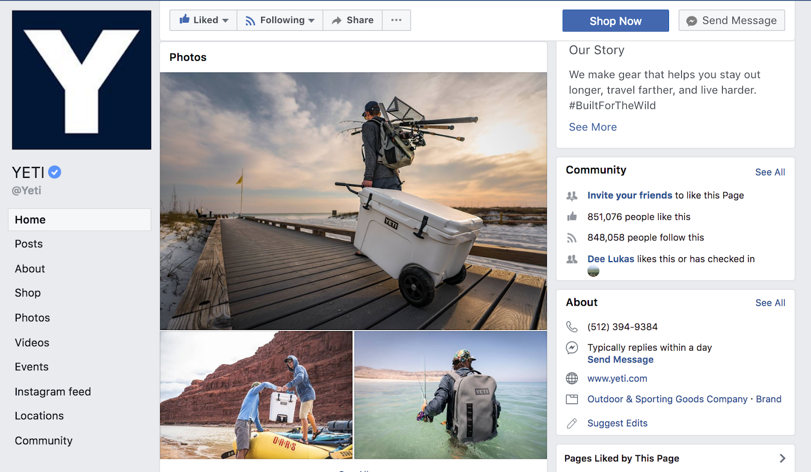
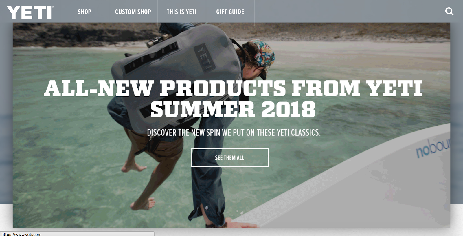
These days, it’s not uncommon for your prospective customers to interact with you or learn about you for the first time through a channel other than your website. If you find that a lot of your website traffic is coming from social channels like Facebook, Twitter, or email, it’s important that your website design reflects or aligns with the designs that you are promoting on those channels.
In other words, you need to make sure that you’re providing brand consistency across all your channels. Your website should look like your Facebook ads, and your email campaigns should use the same typography and colors that can be found on your website.
Recommended Reading: Design principle: Consistency from UX Collective
Source: YETI
7. White Space
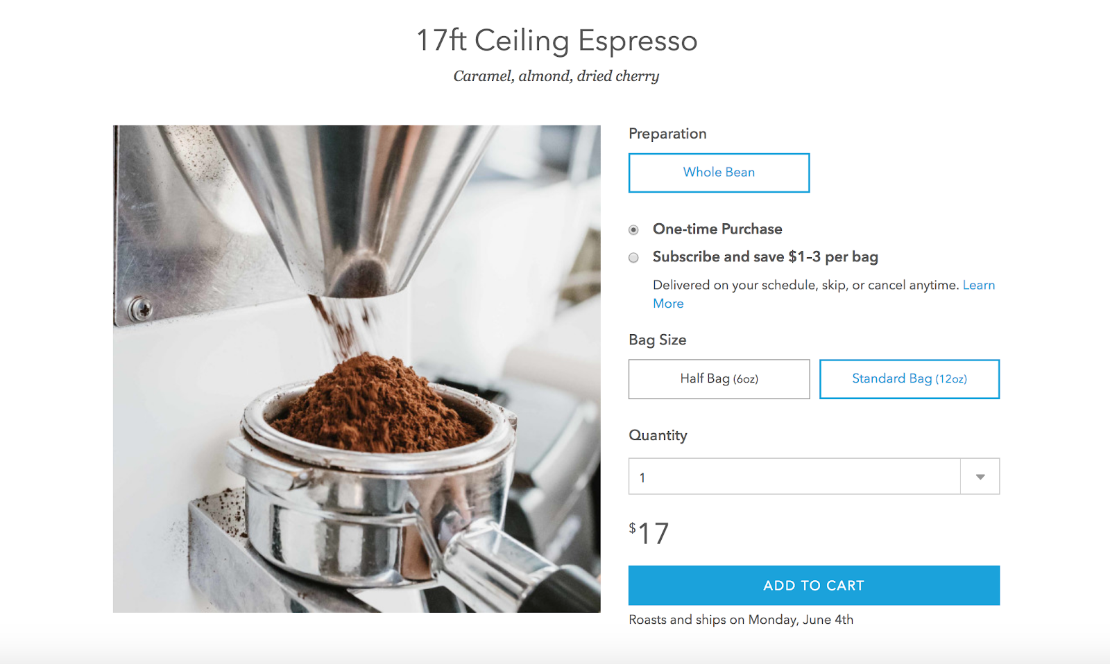
White space is another design principle that should be incorporated into your ecommerce website as a way to reduce bounce rates and increase conversions. This is especially true as more and more people continue to shop primarily from their mobile phones as opposed to desktop computers.
Remember: you don’t have a lot of time to make the right first impression with the people who are landing on your website. In most cases, you only have a matter of seconds. To avoid losing people right away, you need to offer a simple, visually-compelling presentation that they can easily understand with just a glance. Trying to fit too many competing colors, photos, and headings on a single page is the wrong move and can even impact the speed at which your pages load.
Recommended Reading: More Padding, Please! The Power of White Space in Product Design From Wayfair
Source: Blue Bottle Coffee
8. Page Interactivity
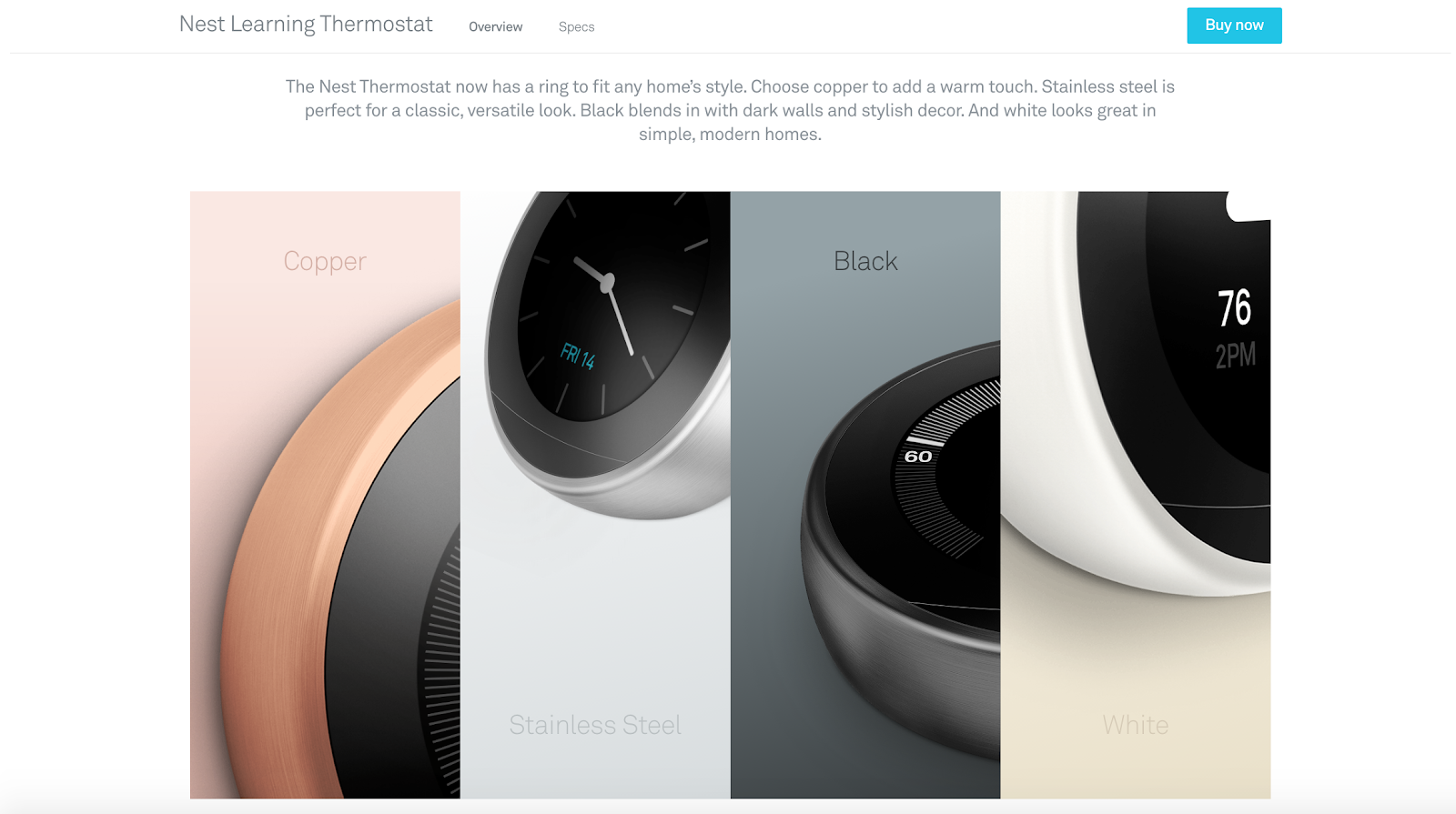
Adding interactive components to your ecommerce website can help boost engagement and encourage prospective customers to learn more about your products. The most common form of interactivity that you can offer on your website comes in the form of a photo gallery (as seen in the first Nest example below).
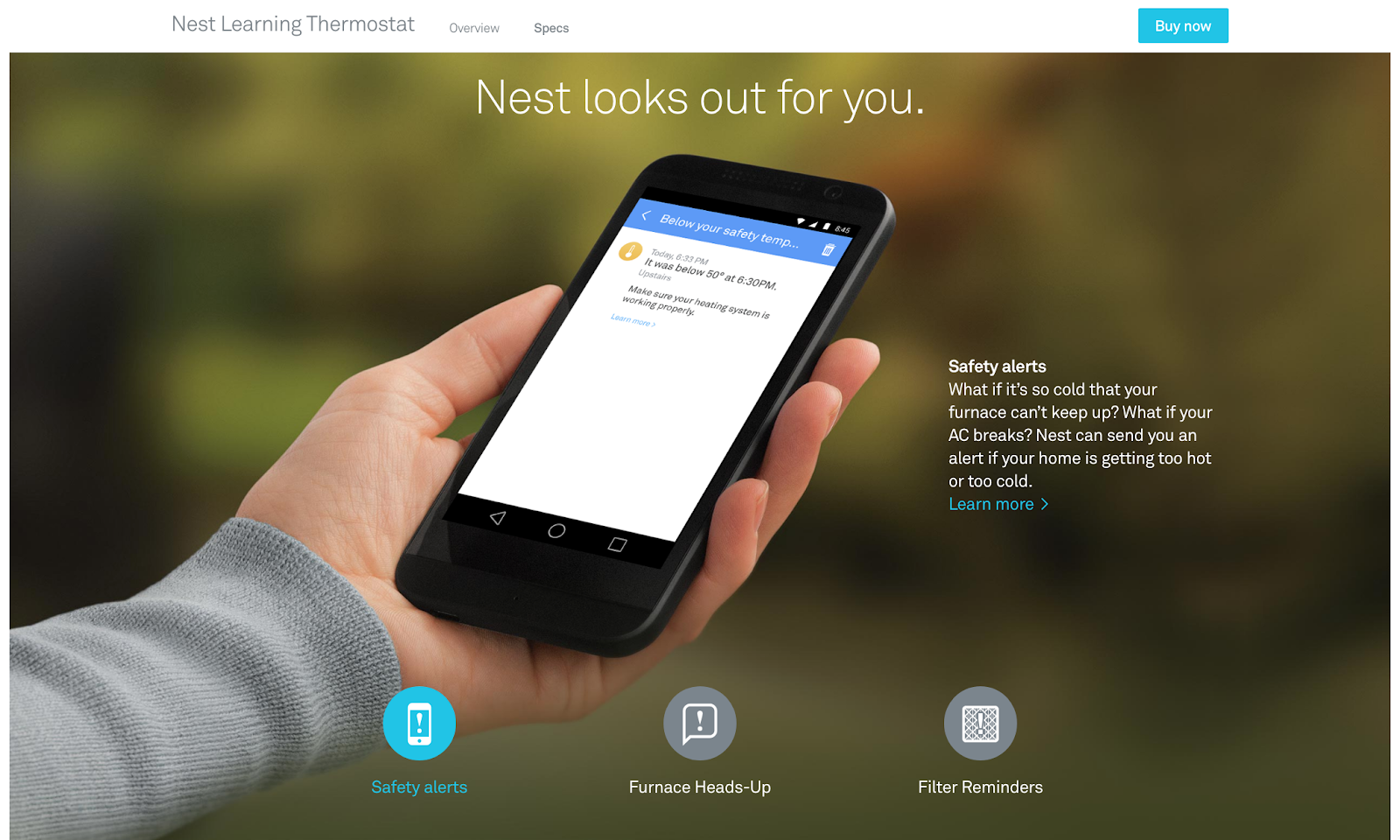
Interactive components not only encourage visitor engagement, they also allow you to keep your pages clean and simple. Information can be condensed in dropdown tables, photos can be slimmed down and expanded upon a click, and entire sections can be hidden until a visitor decides if or when they want to click into it to learn more (as seen in the second Next example below).
Source: Nest
9. Fast-Loading
In addition to making sure your website design is mobile-friendly, you should also take the time to ensure that it loads quickly across all devices and operating systems—from both desktop and mobile.
A slow-loading website can wreak havoc on conversions. According to Shopify, 47% of online shoppers expect web pages to load in two seconds or less. Without a fast-loading website, you risk losing new visitors to competitors who have taken the time to build stronger, quicker, and more reliable shopping experiences for the people who land on their website.
If you’re not sure if your website is meeting those expectations, spend some time analyzing it using this free pagespeed tool from Google. It will help you understand what pagespeed is like for users who access your website on desktop or mobile, and will provide actionable recommendations on how to make your website and web pages load faster.
Recommended Resource: 12 Ways to Improve Ecommerce Site Performance & Speed for 2X Conversions from Shopify Plus
10. Supportive / Helpful
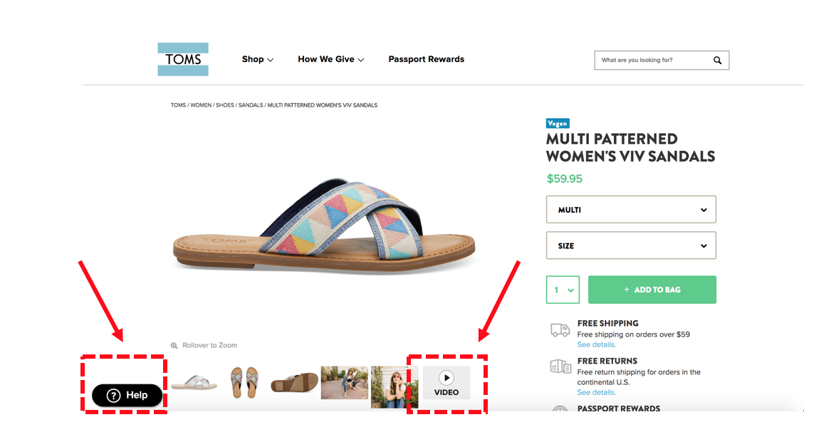
To succeed in ecommerce in 2018 and beyond, you have to create an unmatched experience for your customers from the moment they land on your website for the first time. That means in addition to creating a functional, visually-compelling website for people to explore, you also need to offer support and help at every stage of the buyer journey. You can achieve this in a number of ways on your website. Here are a handful of ideas:
- Idea #1: Implement live chat on your homepage or product pages.
- Idea #2: Create a FAQ or Help section and promote it from your internal pages.
- Idea #3: Create support graphics or videos that you can incorporate throughout your website.
- Idea #4: Create an About Us section that helps visitors remember that there are actual human beings working behind the curtain—people they can reach out and talk to if they need help.
Recommended Reading: Why Every Ecommerce Business Needs a Dedicated Customer Experience Team from Sellbrite
Source: Toms Shoes
11. Trust-Building
As an ecommerce business owner or marketer, a big part of your job is building trust with the people who interact with your brand. Because of the nature of online shopping, some of the people who interact with your website are going to have reservations about buying from you. That’s just the nature of your business. That being said, there are a few simple things you can incorporate into the design of your website to build trust with visitors. Here are some ideas:
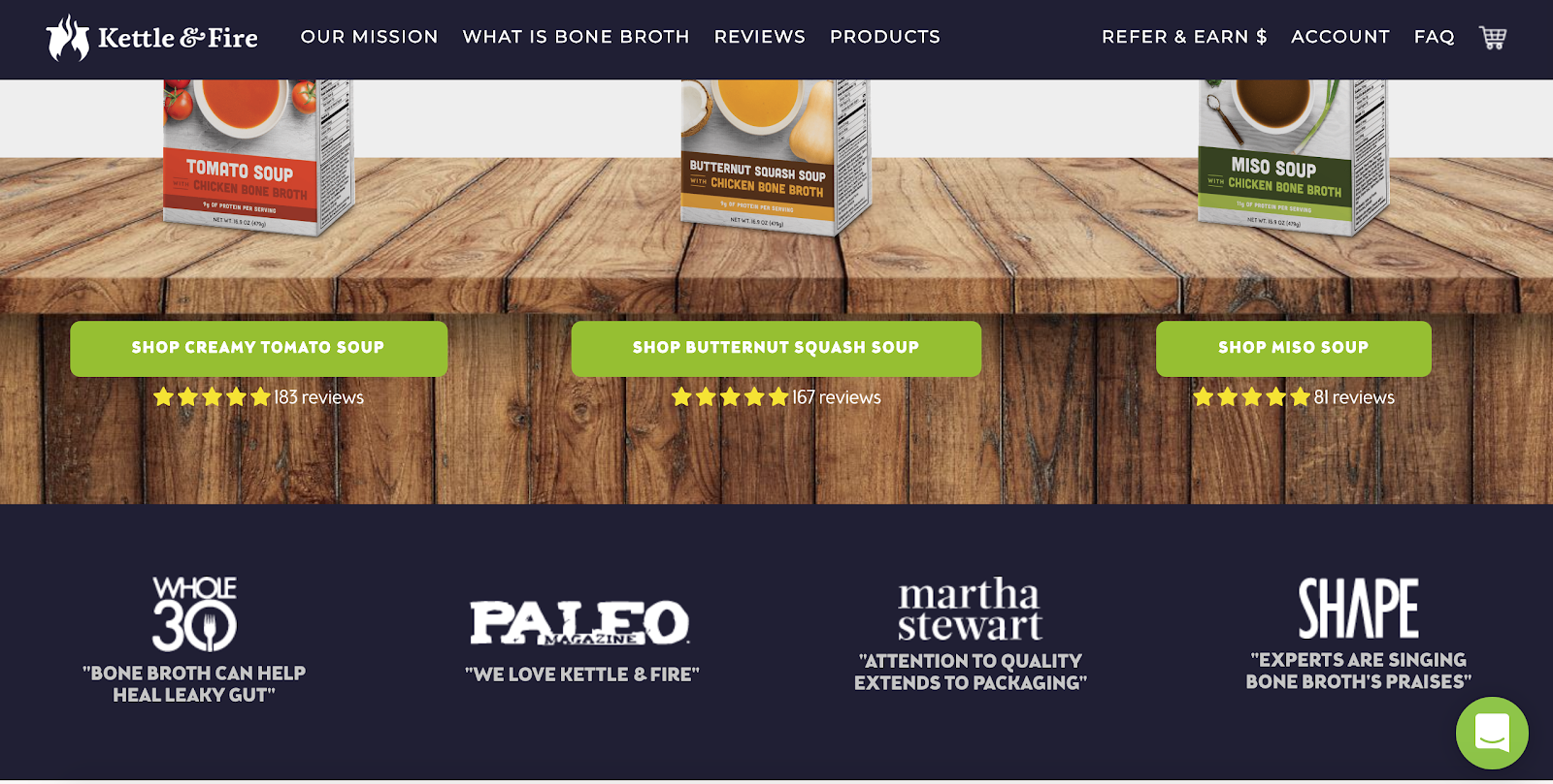
- Idea #1: Add social proof. Feature text or video-based testimonials from happy customers or industry experts prominently on your homepage and product pages. Additionally, you can use a tool like Fomo to show visitors real-time shopping behavior from other people who have also landed on your website.
- Idea #2: Add trust badges. Add badges that help visitors understand what you’re doing to ensure that their private information is being kept safe and secure throughout the checkout process.
- Idea #3: Add reviews and User-Generated Content (UGC). Give customers the opportunity to leave honest reviews and add photos of themselves using or wearing your products.
- Idea #5: Add logos or testimonials from well-known influencers, companies, or publications. Show your visitors who else is happily using your products.
Recommended Reading: An E-Commerce Marketer’s Guide to Social Proof (+ Examples) from Sleeknote
Source: Kettle & Fire
12. Personalized / Familiar
The final component that you can add to your website design to boost conversions is personalization. According to research from Accenture, “75% of consumers are more likely to buy from a retailer that recognizes them by name, recommends options based on past purchases, OR knows their purchase history (Source).
There are a number of ways you can provide a personalized shopping experience for visitors on your ecommerce website. Here are a few common examples:
- You can create branding and specials based on the seasons of the year.
- You can recommend products to visitors based on past purchases.
- You can recommend products to visitors who abandon their carts but return at a later time.
- You can personalize by including a visitor’s name in a heading or live chat message.
To create personalized shopping experiences based on different segments within your target audience, use a 3rd party tool like RightMessage—it allows you to personalize your web pages based on who somebody is, how they’re behaving on your site, and where they are in your funnel.
Recommended Reading: 15 Smart Ecommerce Personalization Examples That Boost Sales from OptinMonster
Over to You
What do you think is the most important factor when it comes to designing an ecommerce website? Share your ideas in the comments below.
